Pinterest Predicts 2026 Home Design Trends A Designer Level Forecast by Living Bright Interiors
Every year, one report shapes the direction of design more accurately than runway shows, trend forecasting agencies, or furniture markets and that is Pinterest Predicts. Unlike traditional trend reports that react to what is already popular, Pinterest predicts what people will search, save, and build before it becomes mainstream.
And 2026 is not about minimalism getting quieter or neutral homes staying safe. 2026 is about emotional belonging, expressive identity, sensory safety, and storytelling through space.
At Living Bright Interiors, we don’t just translate trends. We decode what they mean for how people actually want to live.
Here is your designer-level breakdown of the most important Pinterest Predicts 2026 home design trends and what they really signal about the future of interiors.
Pinterest Predicts is powerful because it reveals what people are reaching for emotionally, not just stylistically. And that’s exactly how I teach design inside The Vibe Curator’s Guide to Interior Design.
The guide is built around one core truth: mood comes first. Scale, rhythm, contrast, flow, and texture are tools — but mood is the reason you use them.
If you’ve ever loved a trend but couldn’t make it feel right in your own home, this is why: vibe curation isn’t about replication — it’s about translation
Before you try any 2026 trend, run it through the Vibe Curator cheat sheet:
Decide how you want to feel first.
Make sure the room has one clear anchor (scale). vibe curators guide
Repeat something three times so it feels intentional (rhythm).
Keep one focal point so the eye knows where to rest (contrast).
If it feels “almost done,” remove something (editing).
That’s the difference between “copying a look” and creating a home that actually supports your life.
––––––––––––––––––––––––––
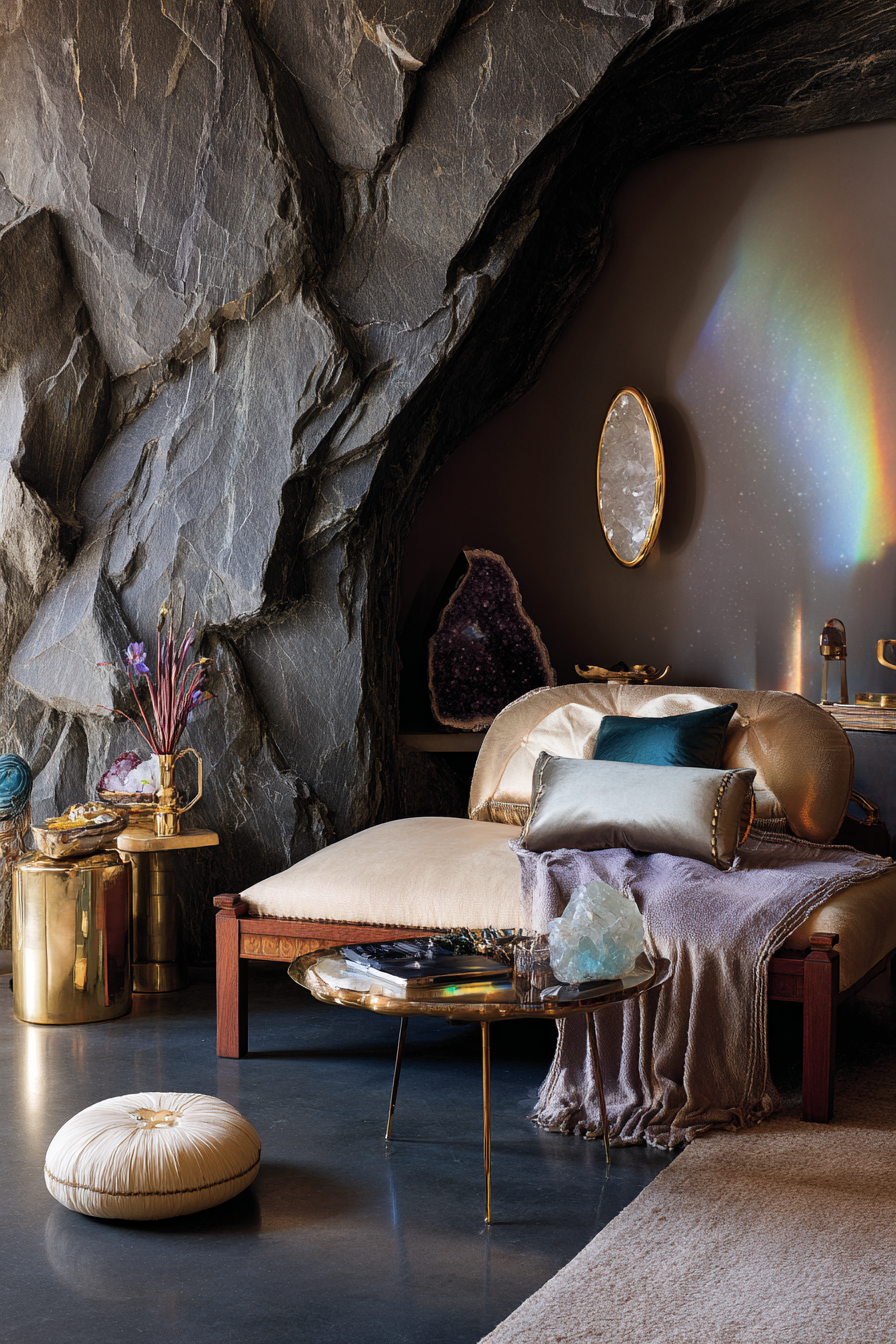
TREND ONE
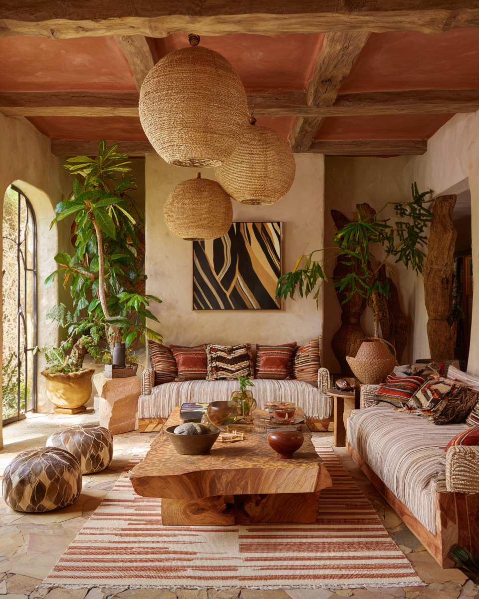
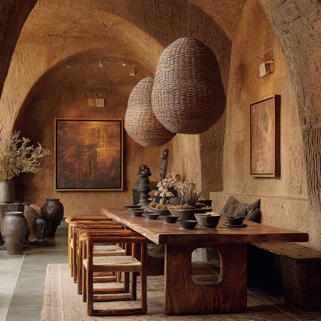
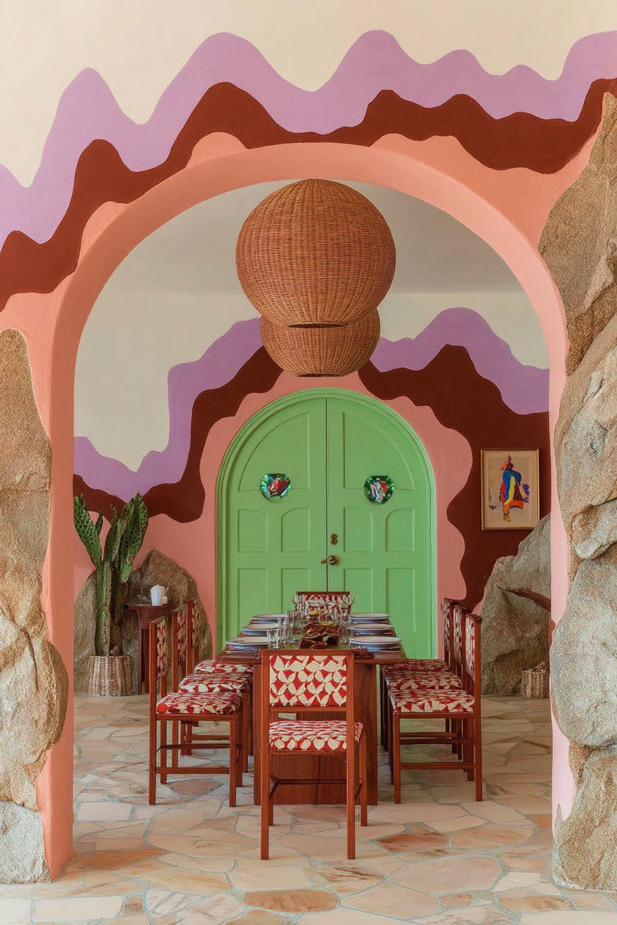
AFROHEMIAN AND GLOBAL MAXIMALIST WARMTH
––––––––––––––––––––––––––


This is not boho as you knew it. Pinterest’s Afrohemian direction signals a powerful cultural shift toward personalization, heritage, craft, and tactile grounding.
This trend is rooted in emotional safety. After years of sterile, algorithmic minimalism, people want spaces that feel alive, layered, human, and warm.
Designer Decode
Afrohemian interiors blend global craft with modern restraint. The key is curated richness, not clutter. This is maximalism with intention.
Materials Leading This Trend
Carved wood, woven baskets, cane, raffia, mudcloth, ceramic, clay, terracotta, limewash, hand-loomed rugs
Color Direction
Sun-baked neutrals, burnt umber, saffron, warm indigo, clay, dusty rust
How to Do This Beautifully
Use one grounding material like carved wood or clay plaster and layer soft texture over it. Keep your foundation calm and let the artisan elements speak.
What to Avoid
Random boho clutter, cheap faux tribal prints, anything that feels theme-based rather than soulful.
Who This Is For Emotionally
Creatives, grounded families, people rebuilding a sense of home, anyone craving warmth instead of visual silence.
Vibe Curator Note: Afrohemian works because it’s mood-led. In the guide, I explain that people consistently respond better to environments where visual information is organized, not competing — when the eye knows where to go, the body relaxes.
So the goal isn’t “more stuff.” The goal is warmth with clarity: define the mood, then let texture and craft do the emotional work. Mood tells you how much is enough — and what it rejects.
Quick Vibe Curator Move: If the room starts to feel cluttered, edit before you add. Most spaces don’t lack personality — they lack clarity.
––––––––––––––––––––––––––
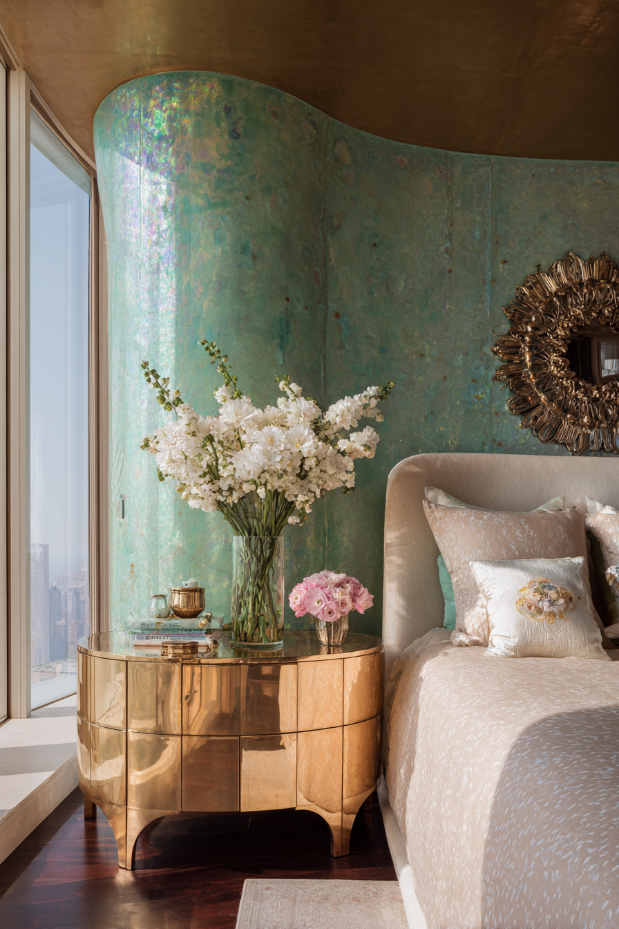
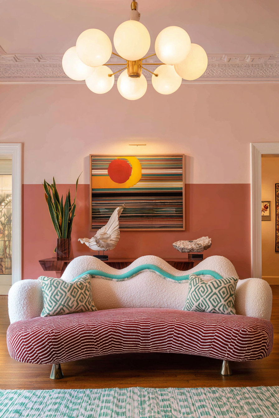
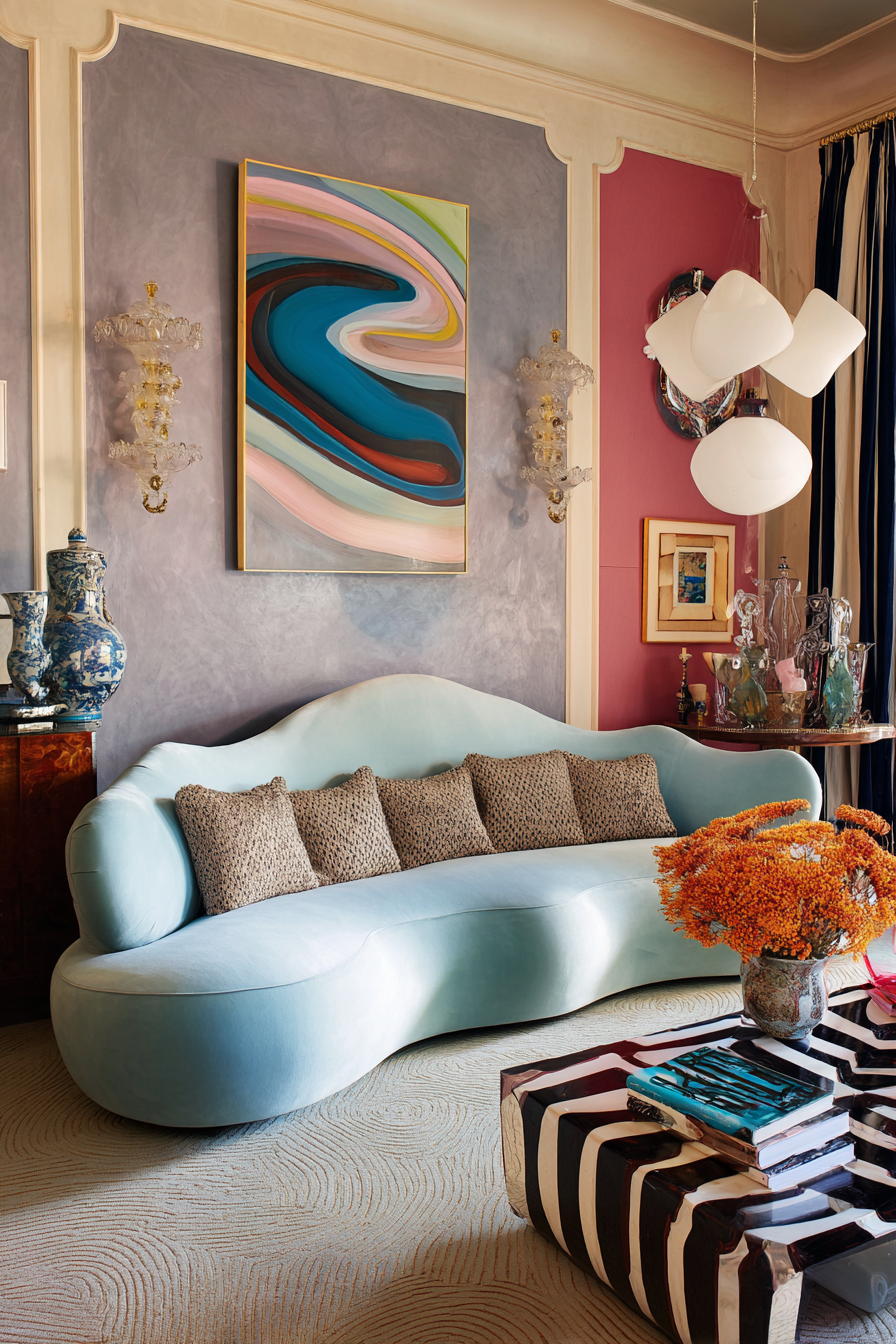
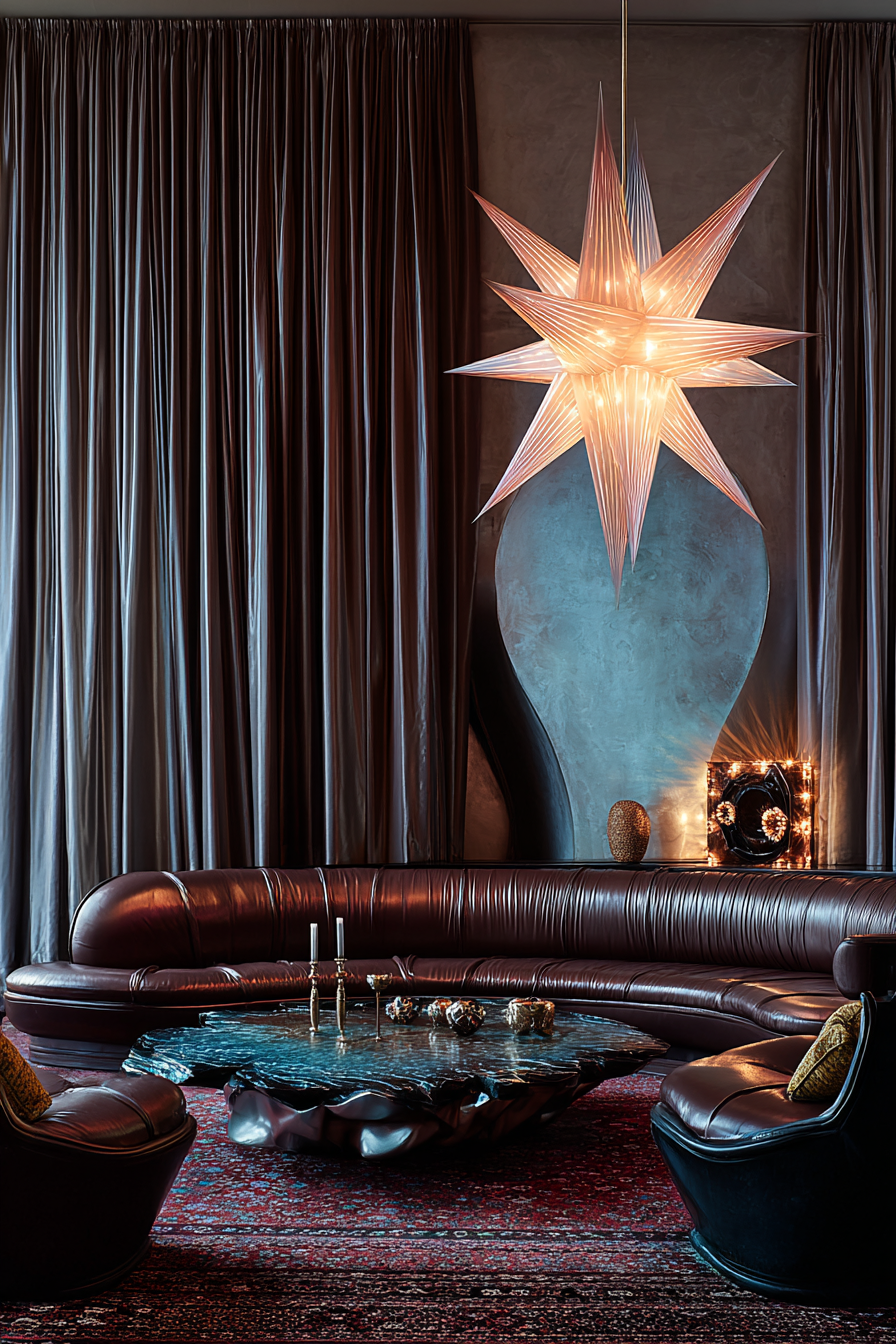
TREND TWO
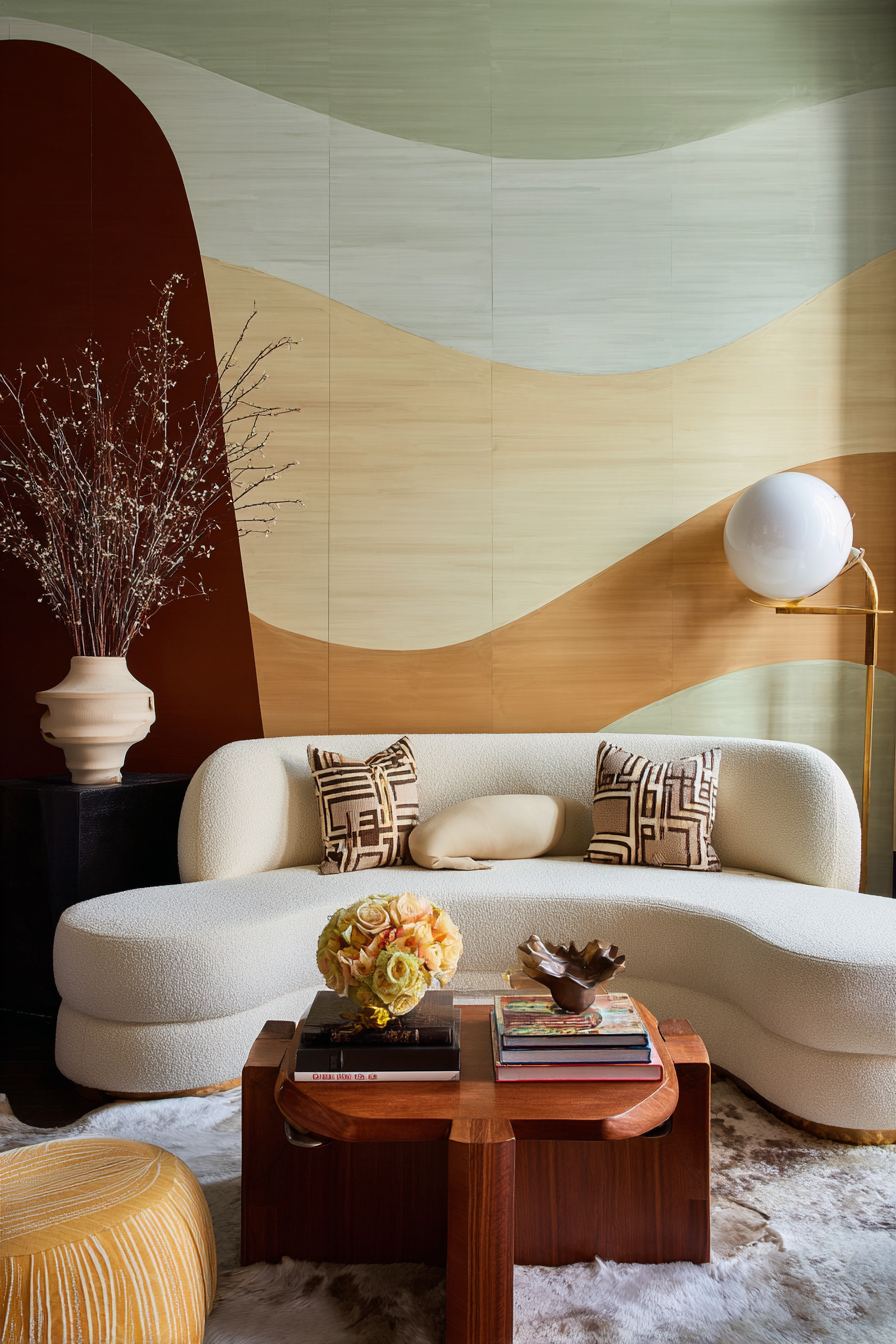
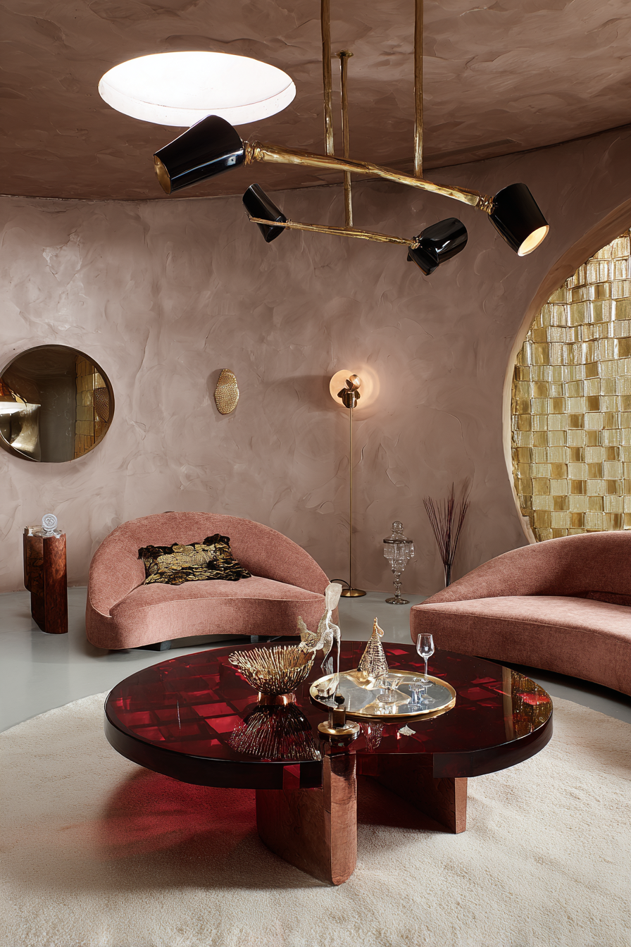
NEO DECO AND THE RETURN OF SOFT LUXURY
––––––––––––––––––––––––––


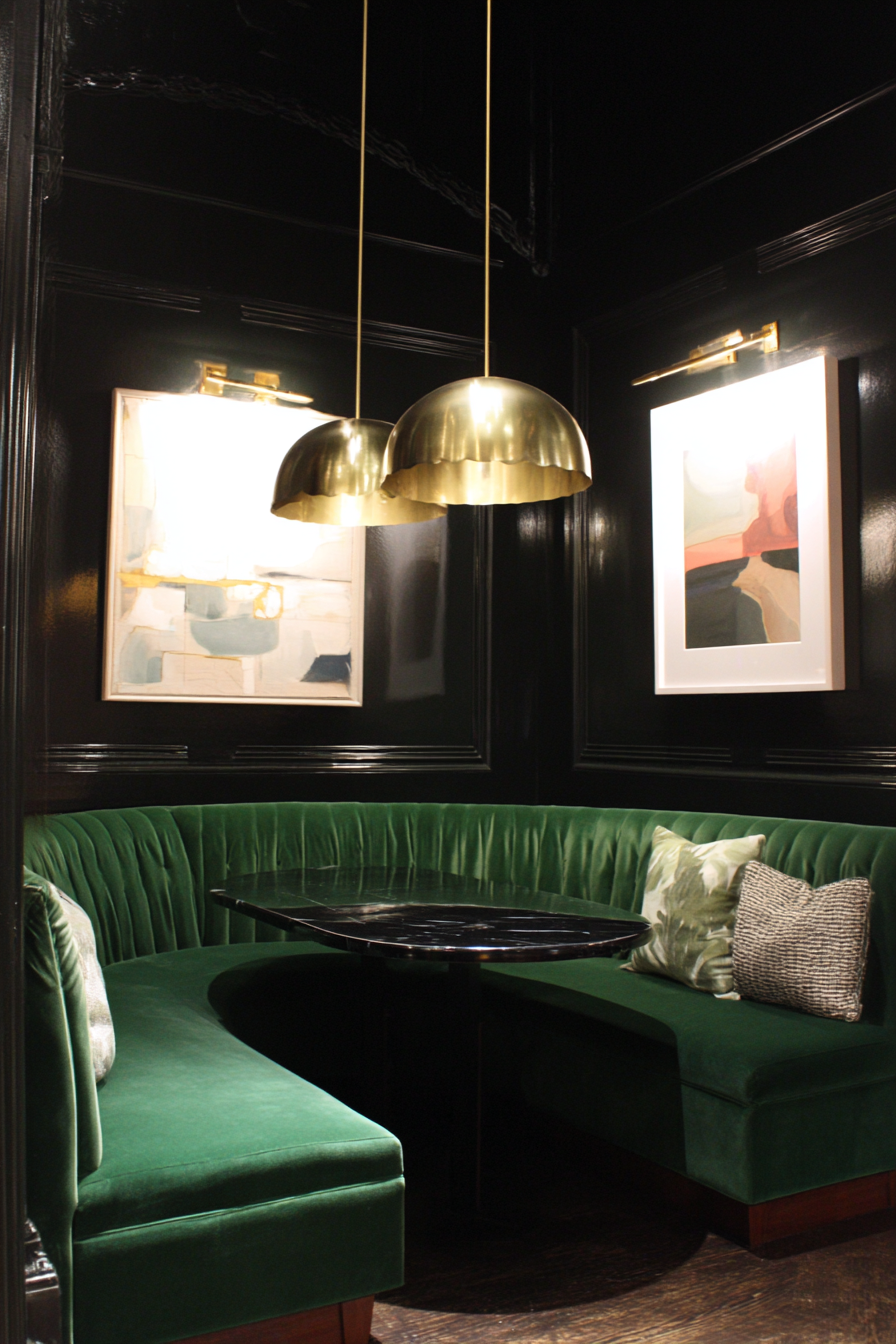


Pinterest Predicts confirms that glamour is returning but not as excess. 2026 luxury is soft sculptural and emotionally indulgent rather than performative.
Designer Decode
Neo Deco is about curves replacing sharp minimalism, brass replacing chrome, stone replacing high gloss plastic. It is elegance without intimidation.
Signature Elements
Fluted marble, curved banquettes, scalloped pendants, brass inlay, smoked mirrors, velvet, lacquer accents
Color Direction
Chocolate brown, midnight blue, antique brass, ivory stone, muted emerald
How to Do This Beautifully
Anchor the space with one statement architectural feature like a fluted fireplace or arched built-in then let lighting and metals quietly elevate.
What to Avoid
Overdoing black lacquer, harsh lighting, heavy 1920s reproduction furniture.
Who This Is For Emotionally
Clients craving indulgence without chaos, people who love elegance but still want emotional softness.
Vibe Curator Note: Neo Deco is a perfect example of why scale is felt before it’s understood. In the guide, I teach that rooms often feel wrong not because of color or style, but because the scale is off — your body registers that as ease or tension before you can explain why.
That’s why this trend looks expensive when it’s done well: you usually have one dominant anchor and everything else relates to it. Without an anchor, scale collapses. v
Quick Vibe Curator Formula: One Big Thing Beats Five Small Things. If the space feels scattered, replace multiple small “decor fixes” with one properly scaled statement element.
––––––––––––––––––––––––––
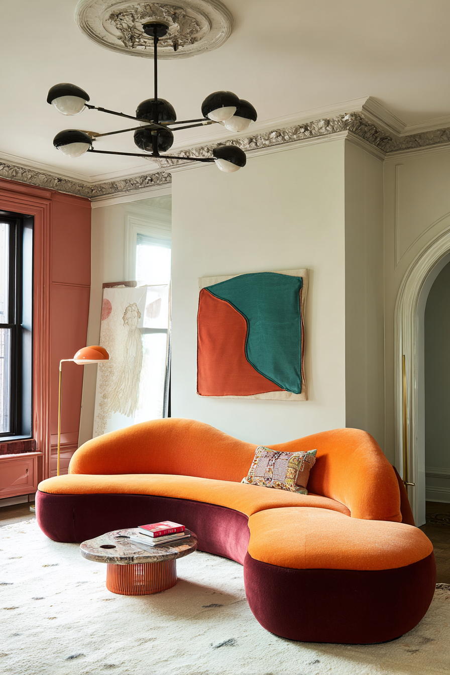
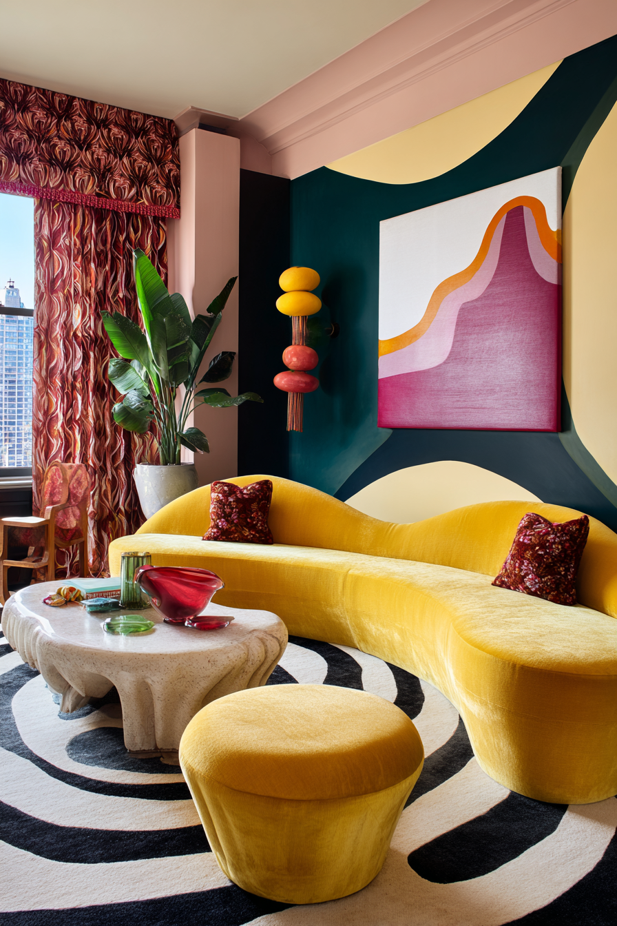
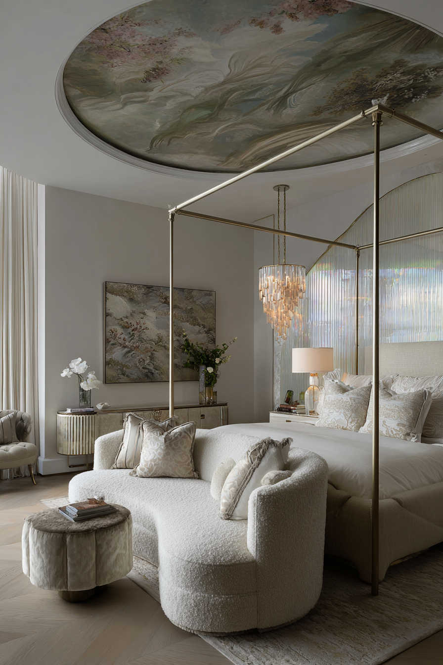
TREND THREE
FUNHAUS AND SCULPTURAL PLAYFUL LIVING
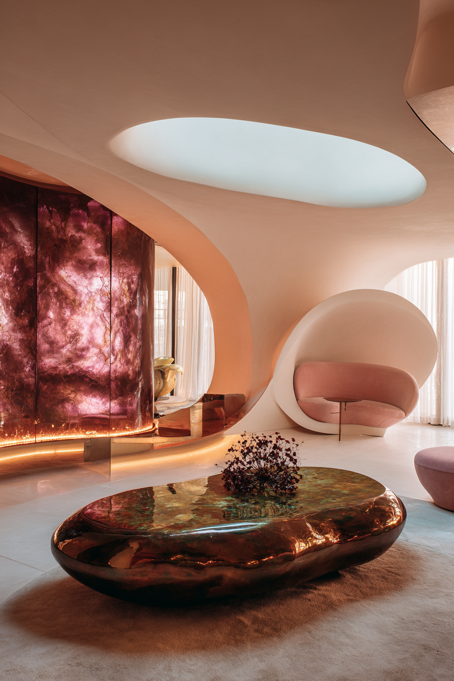
––––––––––––––––––––––––––


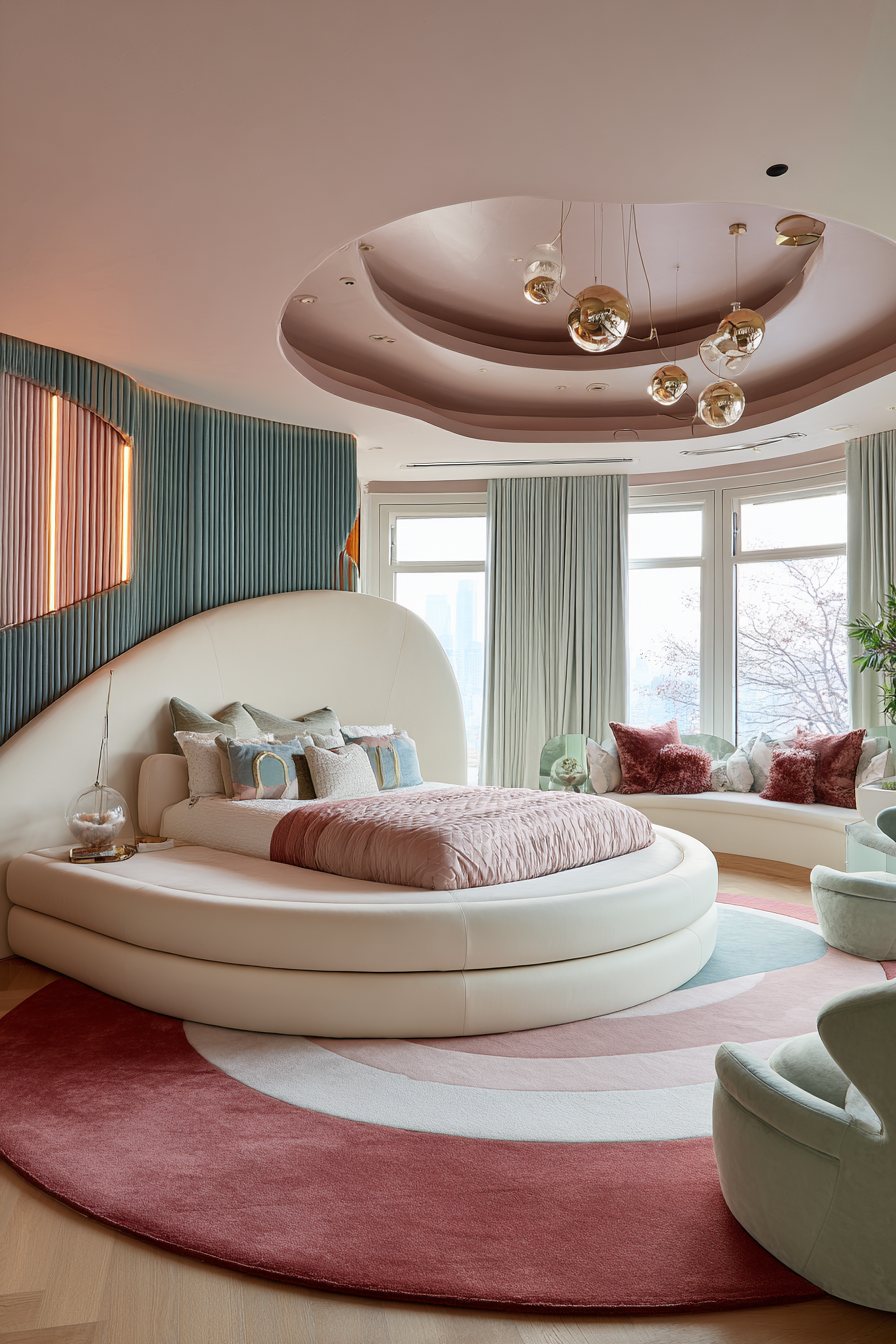
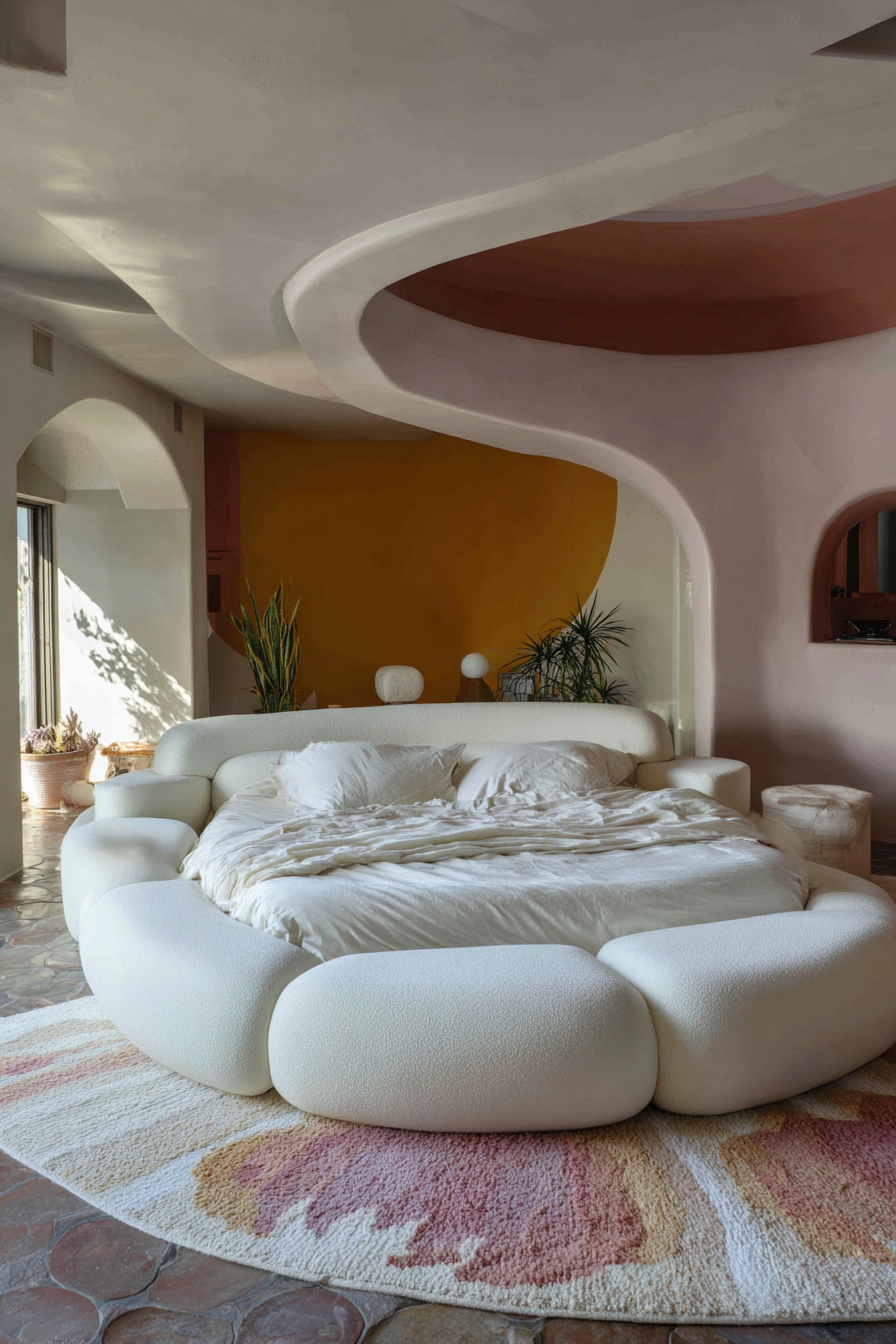
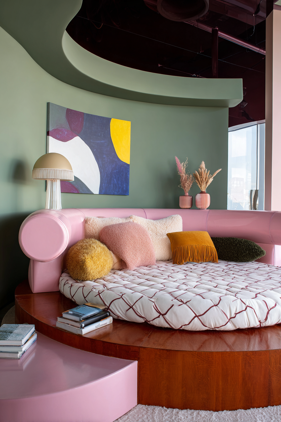


2026 welcomes joy back into interiors. This is emotional rebellion against sterile perfection.
Designer Decode
Funhaus is not childish. It is emotionally intelligent play. Bold shapes signal freedom. Curves signal nervous-system safety.
Design Signals
Wavy sofas, rounded furniture, sculptural lamps, striped ceilings, color blocking, oversized art
How to Do This Beautifully
Balance one bold playful moment per space with grounded materials so it feels joyful not chaotic.
What to Avoid
Overuse of novelty decor, theme rooms, juvenile novelty furniture.
Who This Is For Emotionally
People reclaiming joy, ADHD thinkers, visual creatives, families blending adulthood with fun.
Vibe Curator Note: Playful interiors only feel good when the eye can rest. In the guide, I break down why even minimal rooms can feel busy if rhythm is missing — when every object is different in shape, finish, scale, and placement, the eye has no pathway and keeps starting over.
The fix isn’t toning the fun down. The fix is organizing it.
Quick Rhythm Rule: If something appears three times, the eye accepts it as intentional. Two feels accidental. Three feels designed.
Quick Contrast Rule: Pick one thing to be special. If too many “statement” pieces are equally loud, the room feels confusing.
––––––––––––––––––––––––––
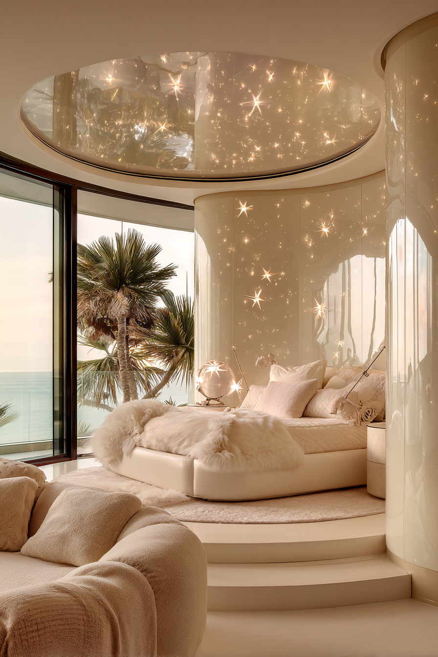
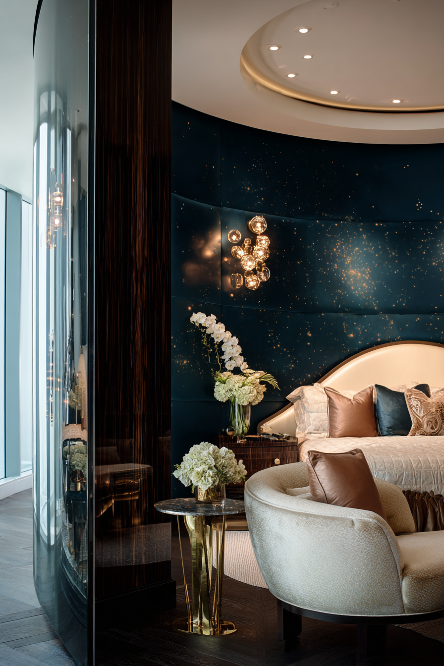
TREND FOUR
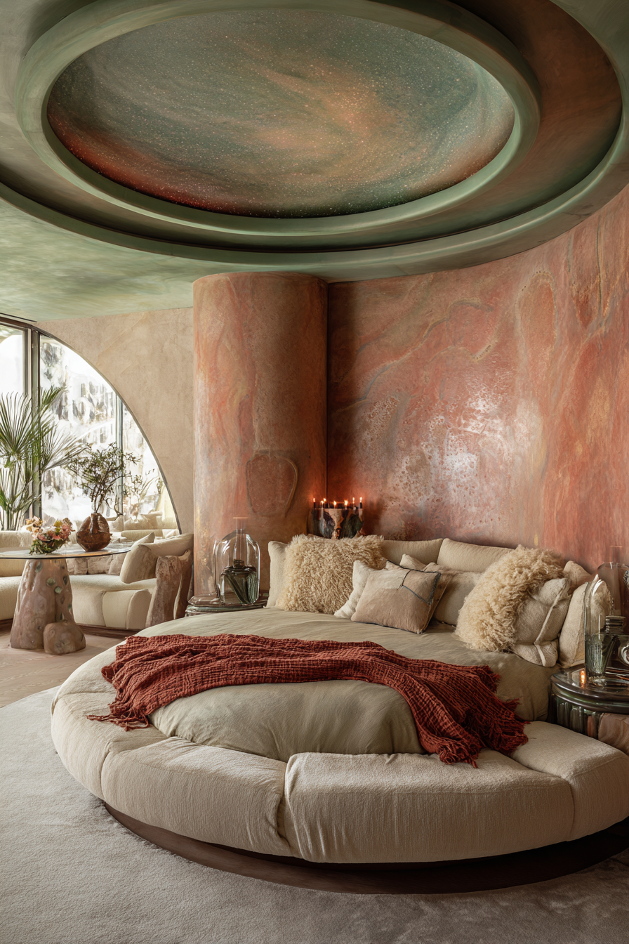
CELESTIAL ETHEREAL AND ALIENCORE INTERIORS
––––––––––––––––––––––––––


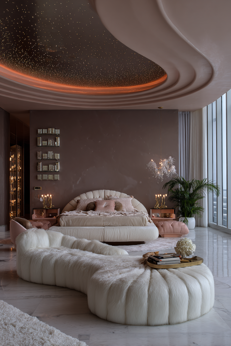
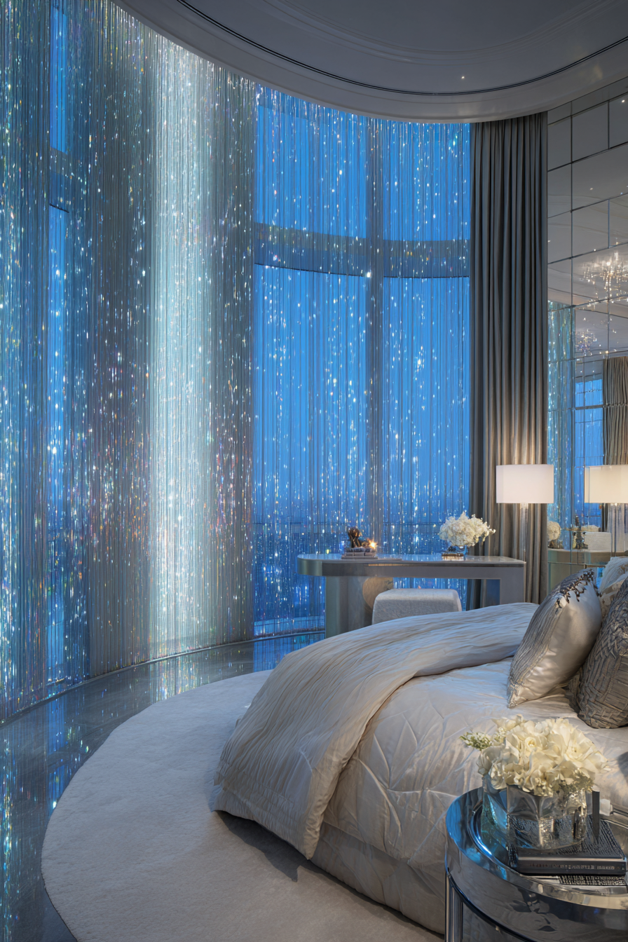
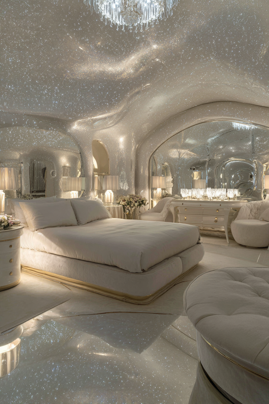


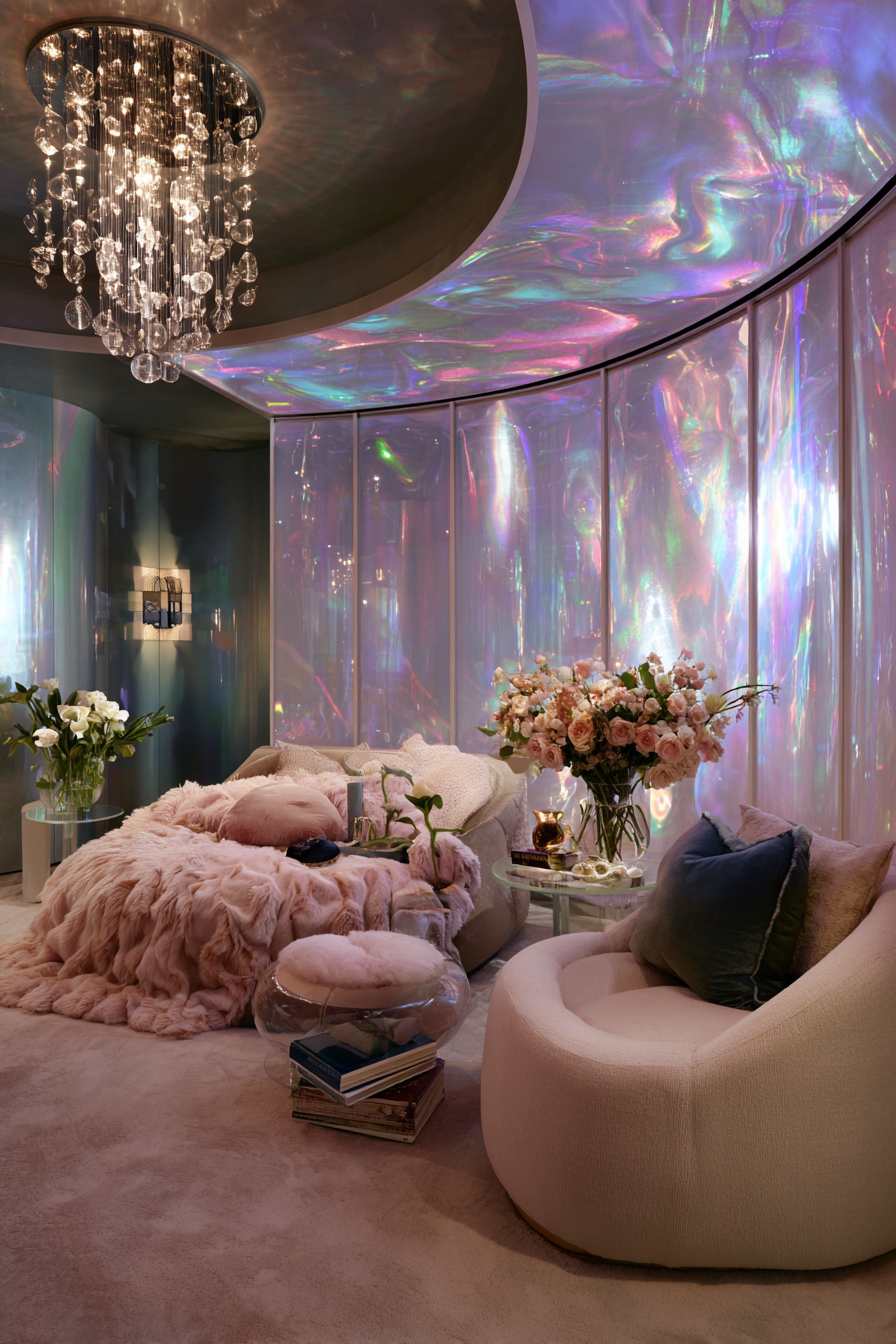


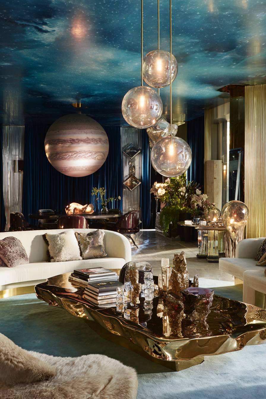


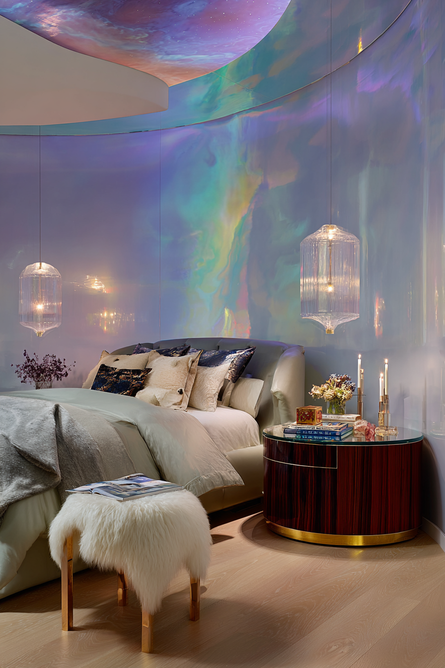


This is where Pinterest Predicts meets future fantasy and it aligns perfectly with the Living Bright Interiors visual universe.
Designer Decode
Celestial interiors soothe through unreality. Curved glass, opalescent finishes, smoky translucency, cosmic glow. These spaces feel suspended in time.
Design Signals
Iridescent surfaces, rounded glass furniture, liquid metal tables, galaxy lighting, soft glowing layers
How to Do This Beautifully
Choose one cosmic texture like iridescent glass and pair with natural grounding materials to keep it livable.
What to Avoid
Cold sci-fi sterility, overuse of LED color lighting, overly digital textures.
Who This Is For Emotionally
Dreamers, futurists, creatives, anyone emotionally drawn to fantasy and wonder.
Vibe Curator Note: Celestial interiors can either feel dreamy or oddly unsettling — and the difference is the same thing I teach in the guide: contrast and clarity.
The brain looks for difference first, not beauty. Whatever is most different becomes the focal point, whether you meant it to or not.
So if everything is glowing, reflective, iridescent, and “special,” nothing wins — and the nervous system works harder to read the room.
Quick Vibe Curator Rule: One room, one focal point. Everything else supports it.
Quick Editing Rule: If the room feels “almost done,” remove something. Less noise = more comfort.
Pinterest Predicts 2026 isn’t announcing a new aesthetic. It’s announcing a new standard: homes that support the nervous system and the life inside them.
That’s why the Vibe Curator framework matters. When you start with mood, decisions stop feeling overwhelming. When rhythm exists, the eye relaxes. When contrast is intentional, focus returns. When flow is clear, the body feels at ease.
This isn’t a formula — it’s a filter that helps you translate trends into spaces that feel like they’re on your side.
––––––––––––––––––––––––––
WHAT PINTEREST PREDICTS 2026 IS REALLY TELLING US
––––––––––––––––––––––––––
2026 is not about trends. It is about emotional intelligence in design.
People are designing for how they want to feel:
Safe
Expressive
Seen
Imaginative
Comforted
Inspired
Minimalism is not over. But it is no longer the default language of safety. Texture, story, and softness have replaced restraint as the new calm.
This is the future of home as nervous-system support, identity expression, and sanctuary.
––––––––––––––––––––––––––
WHY THIS MATTERS FOR LIVING BRIGHT INTERIORS
––––––––––––––––––––––––––
Living Bright Interiors has always been ahead of this curve. Sensory design, emotional safety, surreal fantasy, layered warmth, and expressive spaces have been our design language long before Pinterest Predicts made it mainstream.
From Dreamscapes to Noir to Animal House, the future of design is not sterile. It is soulful.
And 2026 proves that the world is finally catching up.
Each of these trends will be translated into upcoming shopping edits, Amazon look-for-less guides, Pinterest boards, and visual design books within the Living Bright Interiors Visual Series.
This is not the end of this forecast. It is the beginning of a new design era.
And if you want to apply these trends without second-guessing yourself, this is exactly what The Vibe Curator’s Guide to Interior Design is for.
You don’t need permission. You don’t need to be “good at design.” You already live in your body — you already know how spaces make you feel. The guide simply gives you language (and a repeatable filter) for designing from that truth.
If you ever feel stuck, come back to the three questions I teach in the guide:
How do I want to feel here?
What’s getting in the way of that?
What can I remove before I add? vibe curators guide to interior…
Ultimate Vibe Curator Question: Does this help me live better here?