


Cloud Dancer in a Complicated America: Why Pantone’s 2026 Color of the Year Feels Tone-Deaf — And Why It Still Makes Sense in Design
Cloud Dancer Isn’t Landing the Same for Everyone — And That Reaction Is Real
When Pantone named Cloud Dancer, a soft white, as the 2026 Color of the Year, the internet didn’t just buzz — it erupted.
And as a Black woman watching the cultural climate of America in real time, I understood the backlash immediately.
Whether Pantone intended it or not, this color announcement arrived in a moment where:
DEI efforts are being rolled back
coded “purity” language is resurfacing
political polarization is at its peak
whiteness as an aesthetic is being culturally re-centered
far-right rhetoric is louder
marginalized communities are feeling the impact
So when Pantone uses descriptors like:
“purity,” “cleansing,” “returning to simplicity,”
it doesn’t land as softly as Cloud Dancer’s visual tone.
If your first thought was:
“Wow… choosing a white color now? Did they not read the room?”
You are absolutely valid.
Your discomfort is justified.
The timing feels… off.
And many people are reading symbolism that reflects the tension in our culture.
I felt it too.
But Here’s What Surprised Me — Two Things Can Be True at the Same Time
Once I stepped out of the cultural reaction and looked through the lens of interior design, global marketing, and color psychology, Cloud Dancer took on a different meaning.
Because Pantone doesn’t pick colors based on politics.
They pick colors based on:
emotional exhaustion
market saturation
global sentiment
economic anxiety
what corporations are buying
and what consumers actually use
From that angle — Cloud Dancer makes sense.
So this article exists to hold both realities:
Reality #1: The cultural timing is messy.
Reality #2: The design logic is strong.
If you want the strictly design-focused guide with rooms, textures, palettes, and mood boards, we released that yesterday.
I’ll link it throughout this article for deeper reference.
Today?
Today we’re talking about the why behind the worldwide reaction.
🌪️ Why Neutrals and Whites Rise During Times of Instability
Design history always follows emotional climate.
When people are overwhelmed, overstimulated, and anxious, interiors shift toward:
simplicity
softness
calmness
quiet palettes
sensory regulation
This isn’t new.
After the 2008 recession →
We saw grey, greige, oatmeal, and taupe dominate every home.
During the pandemic (2020–2021) →
Blues, earth tones, and comfort colors surged because people craved emotional grounding.
During cultural overstimulation (2022–2025) →
Scandi minimalism, quiet luxury, and textured neutrals took over.
Cloud Dancer is simply another step in that arc.
It’s not a color about whiteness — it’s a color about void, silence, and reset.
When the world is noisy, people crave a blank page.
🎨 Why Colors Were More Vibrant During 2020–2021 Cultural Movements
Contrast this with moments of:
activism
Black Lives Matter
collective identity formation
self-expression
maximalism
cultural reclamation
generational empowerment
And you get color explosions.
In 2021, we saw:
digital lavender
serotonin yellows
restorative greens
bold terracotta
dopamine décor
richly saturated palettes
Why?
Because when society expresses itself loudly, interiors do too.
Color becomes voice.
Color becomes rebellion.
Color becomes identity.
When the culture leans inward (as it is now), design becomes quiet.
🏢 Cloud Dancer Is Also a Corporate Strategy (Let’s Be Honest)
Pantone works with:
luxury brands
major retailers
corporate packaging companies
global partners
advertisers
And globally, corporations are shifting toward:
safer messaging
neutral branding
simplicity
minimal palettes
unobjectionable tones
high-photogenic value
A soft white is:
easy to market
universal
neutral
adaptable
safe
sellable
That doesn’t make it bad — it makes it predictable.
Where culture is loud, corporations go quiet.
Where politics polarize, branding neutralizes.
Where humans feel overwhelmed, companies lean minimal.
Cloud Dancer reflects that corporate psychology perfectly.
🤍 So Where Does That Leave Us in Actual Interior Design?
Here’s where awareness + design intelligence intersect.
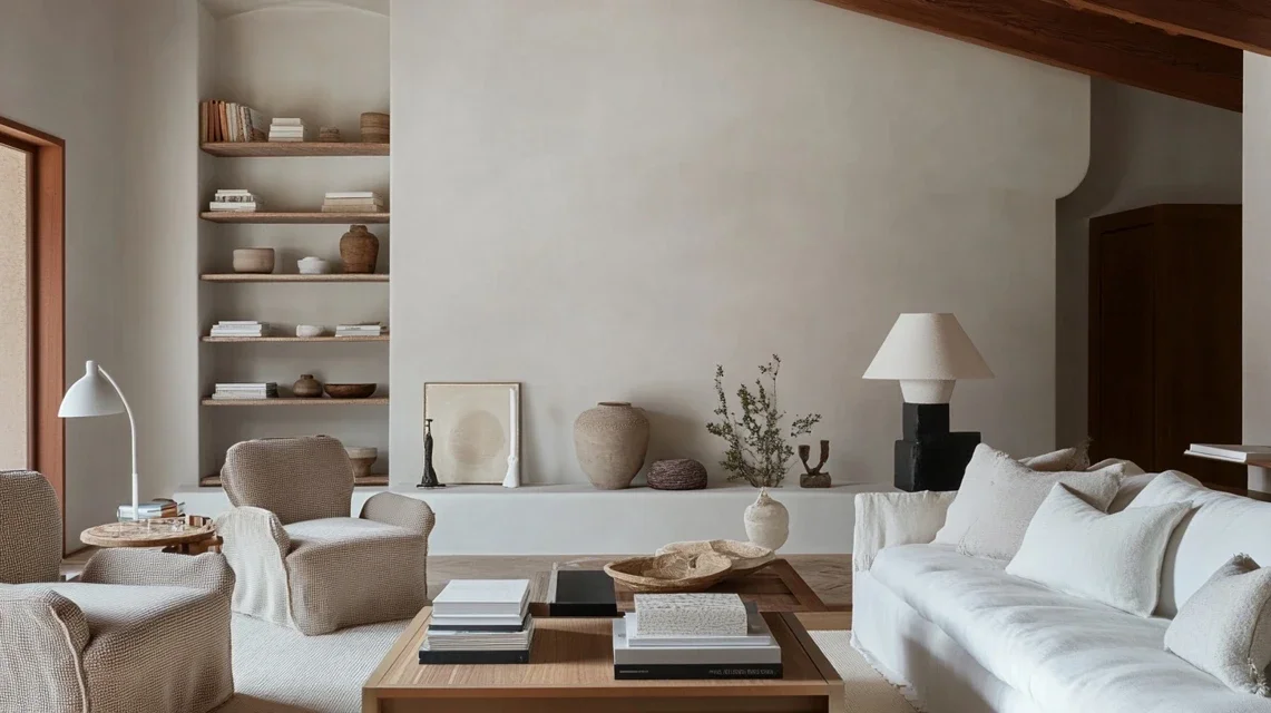
From a design perspective, Cloud Dancer works because it offers:
a soft alternative to stark whites
a sensory reset
calm visual field
high versatility
sculptural beauty on textured walls
compatibility with oak, walnut, stone, and metals
ethereal light reflection
It’s not about whiteness — it’s about breath.
It doesn’t dominate a room.
It creates space within it.
For homes caught between overstimulation, information overload, and emotional heaviness, Cloud Dancer acts as a pause.
And sometimes a pause is exactly what your nervous system needs.
For the design execution, see the full guide we released yesterday with mood boards, interior examples, and color pairings.
🌈 A Black Woman Designer’s Bottom Line: Cloud Dancer Is Tone-Deaf Culturally — But Powerful Emotionally
Here’s my truth:
💬 Culturally?
Pantone choosing a white color this year feels disconnected, privileged, and poorly timed.
💬 Design-wise?
Cloud Dancer is exactly what many homes emotionally need in a heavy era.
It doesn’t erase culture.
It doesn’t negate diversity.
It isn’t symbolic of whiteness unless assigned that meaning.
When used intentionally, Cloud Dancer becomes:
a clearing
a reset
a softening
a place to exhale
a neutral ground for personal expression
a space to rebuild and redesign your story
And maybe that’s the resonance we weren’t expecting —
that sometimes a blank page isn’t erasure…
it’s permission.