Pantone 2026 Color of the Year: Cloud Dancer — A Vibe Curator’s Guide to Styling Calm, Light-Filled Homes
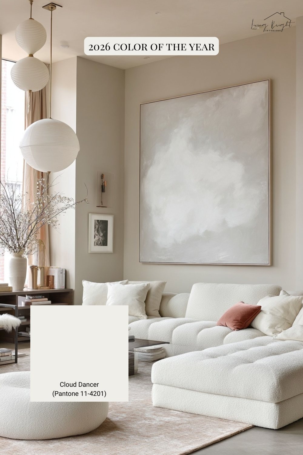
Cloud Dancer (PANTONE 11-4201) has officially been named the 2026 Pantone Color of the Year, marking the first time in Pantone history that a white has taken the title. Soft, airy, and quietly luminous, Cloud Dancer is more than a neutral—it’s a reset, a breath, and a return to simplicity.
Below, you’ll find the most comprehensive guide online, updated for 2026, including designer insights, color pairings, styling guides, and visual examples you can try.
✨ The Vibe Curator’s Perspective
At Living Bright Interiors, we don’t follow color trends—we interpret them through energy, psychology, and lived experience.
As a Vibe Curator, I look at Cloud Dancer not just as “a white paint,” but as a tool for emotional regulation, visual clarity, and lifestyle alignment.
This shade isn’t about minimalism for Instagram.
It’s about creating homes that feel safe, soft, and supportive in real life.
This approach is the foundation of The Vibe Curator’s Guide to Interior Design, where I teach how to translate trends into spaces that actually work for your nervous system, routines, and personality.
⭐ What Is Cloud Dancer?

2026 Color of The Year finally announced by Pantone as: Cloud Dancer
Cloud Dancer (Pantone 11-4201) is a soft, warm-toned white with subtle natural undertones.
It feels airy, billowy, and calming—ideal for tone-on-tone interiors and quiet luxury spaces.
⭐ Is Cloud Dancer Warm or Cool?
Cloud Dancer is a warm white, but not creamy or yellow.
It leans toward:
Soft linen
Milk foam
Plaster white
Cloud haze
This makes it extremely versatile: perfect for minimalism, sensory design, quiet luxury, and natural materials.
⭐ Why Pantone Chose Cloud Dancer for 2026
Pantone’s selection reflects the global mood shifting toward:
1. A Psychological Fresh Start
White = clarity, renewal, mental openness.
2. Sensory-Centered Interiors
Cloud Dancer works as a calming backdrop that supports emotional regulation and creative flow.
3. The Rise of Texture-Forward Design
2026 is not about color saturation—it’s about material depth.
4. A Return to Intentional Living
People want slower spaces with visual quiet. Cloud Dancer delivers that without feeling empty.
💡 Vibe Curator Tip
In the Vibe Curator method, color is only one layer of atmosphere.
Cloud Dancer works best when it’s paired with:
the right textures
the right lighting temperature
and the right layout flow
I break this down step-by-step in The Vibe Curator’s Guide, including room formulas and sourcing shortcuts.
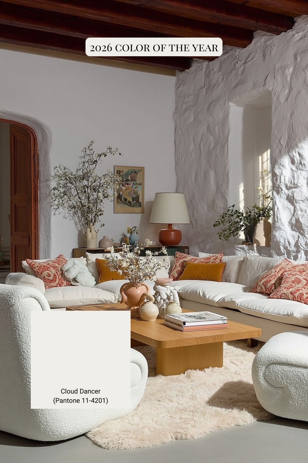
⭐ Cloud Dancer Interior Design Guide
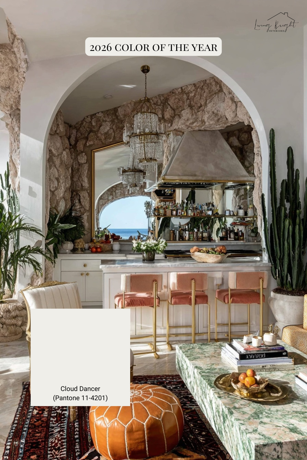
Click to shop the look and pantone swatches
1. Use Cloud Dancer on Textured Walls (Limewash, Plaster, Stucco)
Cloud Dancer transforms dramatically when applied to textured surfaces, turning simple walls into sculptural elements.
2. Best Colors That Pair With Cloud Dancer
Neutral Pairings:
Soft Sand
Mushroom
Putty
Milk chocolate brown
Oak tans
Color Pairings:
Eucalyptus green
Silver s
Smoky lavender
Terra-cotta
Warm bronze
Dramatic Pairings:
Charcoal
Blackened steel
Deep walnut
🎯 Want This Done For You?
If you love these pairings but don’t want to guess how to apply them in your own home, the Vibe Curator’s Guide includes:
✔ Pre-built palettes
✔ Room-by-room formulas
✔ Amazon-ready sourcing links
✔ Layout psychology tips
So you’re not starting from scratch.
shop designs using cloud dancer and amazon FINDS
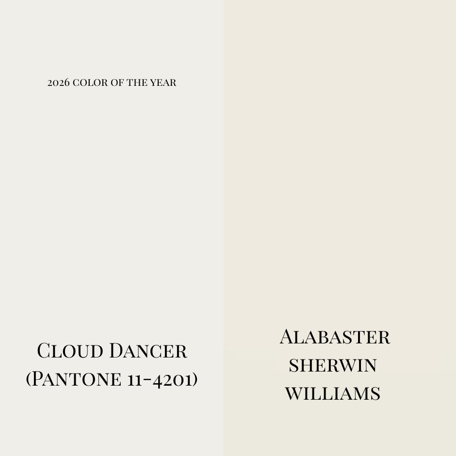
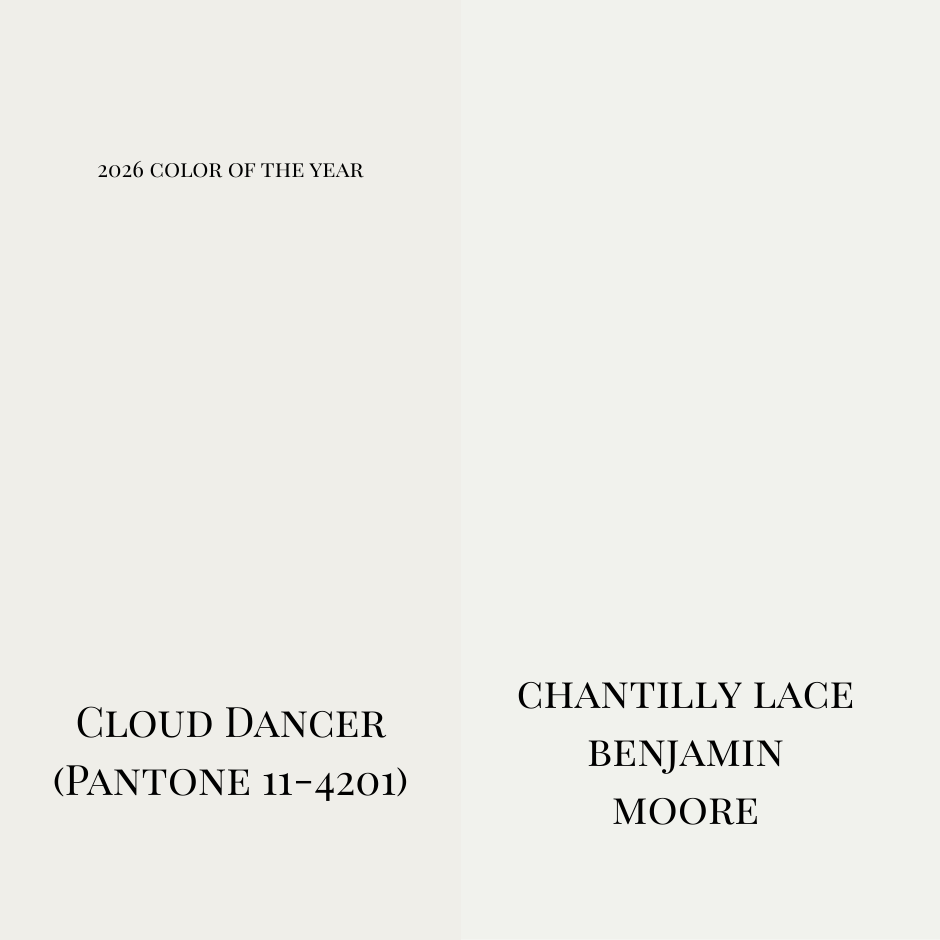
3. Cloud Dancer vs Other Popular Whites (Comparison Chart)


⭐ How Cloud Dancer Shows Up in Different Rooms


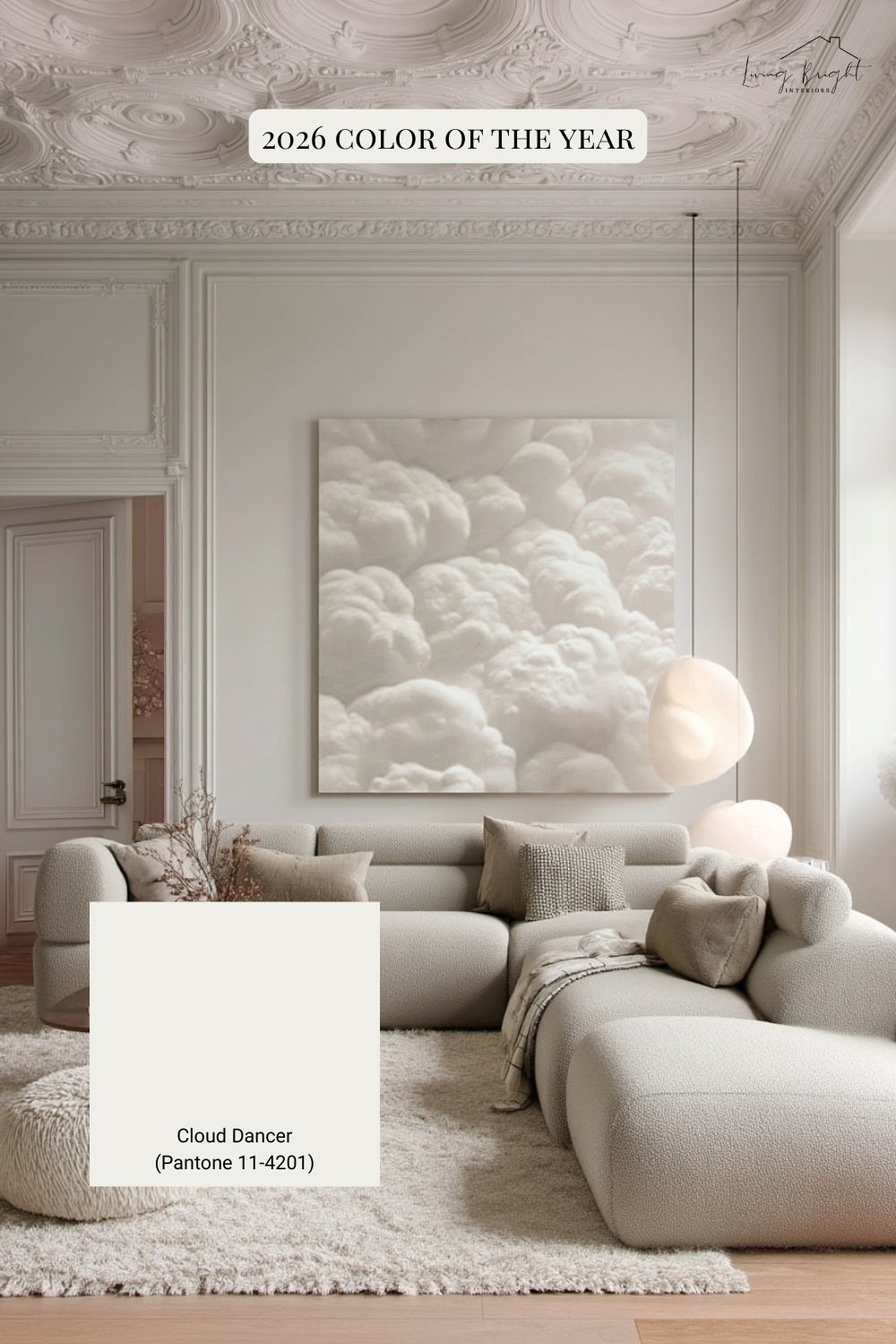
Cloud Dancer Living Room
Tone-on-tone furniture, boucle chairs, textured rugs.
Cloud Dancer Bedroom
Softest possible palette for nervous system support.
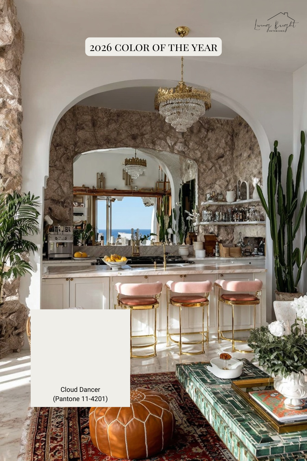
Cloud Dancer Kitchen
Warm stone counters + Cloud Dancer cabinetry = quiet luxury.
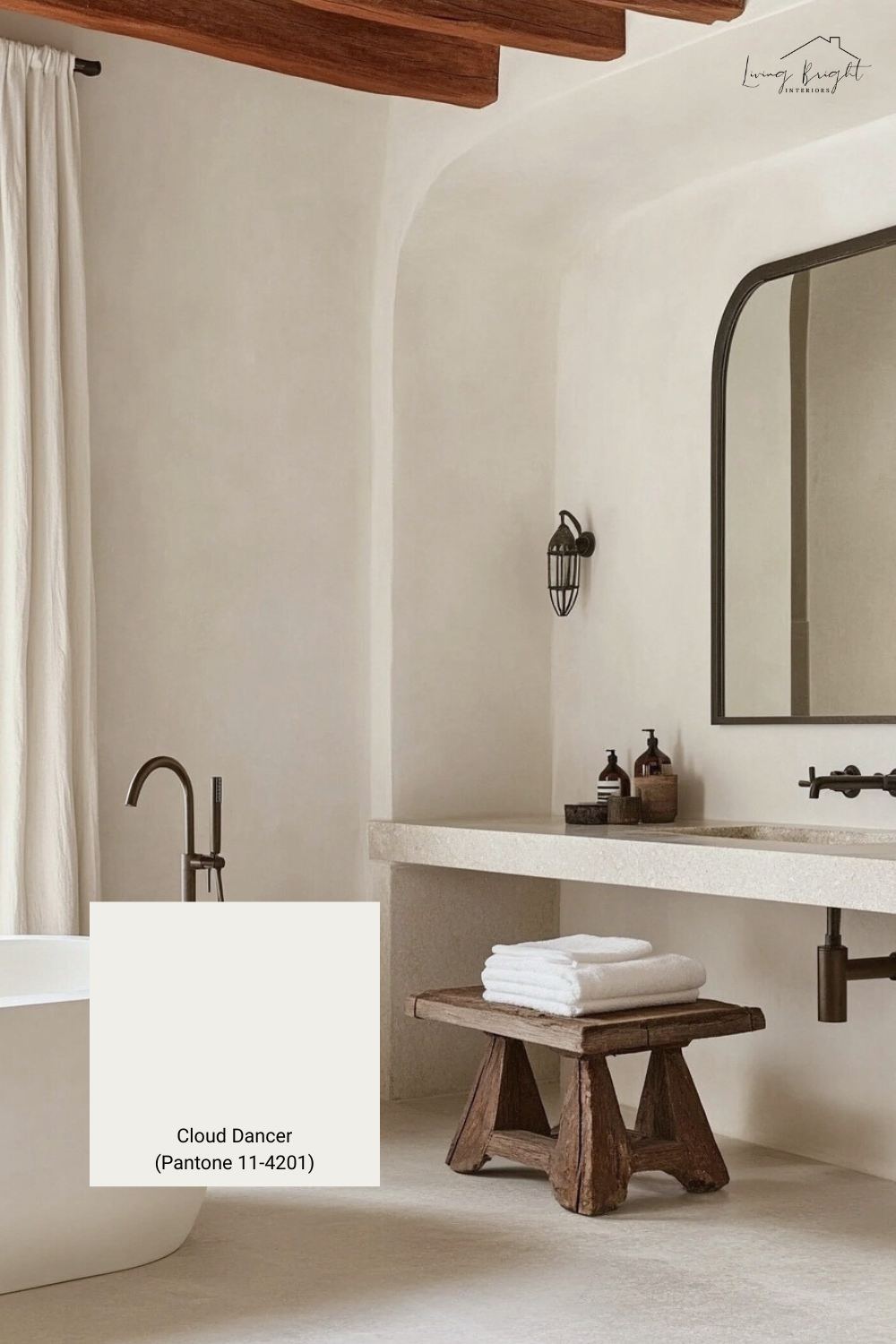
Cloud Dancer Bathroom
Plaster walls, warm metal fixtures, minimal styling.
⭐ Cloud Dancer in 2026 Trend Forecasting (Designer Insight)
“Cloud Dancer is the color of emotional reset. In sensory design, white acts as a visual breath that brings coherence to a space. It’s the tone you reach for when you want clarity without austerity. People don’t love white but it’s the perfect environment to house the vibrancy of life within the colors walls”
— Crystal Bright, Interior Designer, Founder of Living Bright Interiors
Ready to Curate Your Own Calm?
Cloud Dancer works because it supports how people actually live.
That’s the heart of Vibe Curation.
If you’re ready to stop copying trends and start designing intentionally, the full framework lives here:
👉 The Vibe Curator’s Guide to Interior Design
⭐ Frequently Asked Questions
Is Cloud Dancer a good wall color?
Yes — especially in textured finishes like plaster, stucco, and limewash.
Does Cloud Dancer work in low-light rooms?
Yes, but pair it with warm bulbs (2700K–3000K).
Is Cloud Dancer the same as Cloud White?
No — Cloud Dancer is softer, more linen-like, and less yellow.
Can Cloud Dancer work in modern interiors?
Absolutely. Its softness adds warmth to hard lines and minimalist forms.
⭐ The Vibe Curator Formula for Using Cloud Dancer
When I design with Cloud Dancer, I follow a simple three-part system:
1. Base Calm
Cloud Dancer on walls, ceilings, or cabinetry creates visual stillness.
2. Sensory Anchors
Layer in wood, stone, boucle, linen, and metal to prevent flatness.
3. Emotional Accents
Introduce 1–2 grounding tones (clay, moss, walnut, bronze) to add life.
This formula keeps white spaces from feeling sterile—and turns them into environments that feel lived-in and nurturing.
This framework is expanded throughout The Vibe Curator’s Guide, with real examples and shopping links.
⭐ Final Thoughts: Cloud Dancer Is the Color of Renewal
Soft. Airy. Uplifting. Transformative.
Pantone’s Cloud Dancer is not just a white—it’s the palette cleanser of a generation that craves emotional calm and intentional living.
2026 is the year of interiors that breathe.