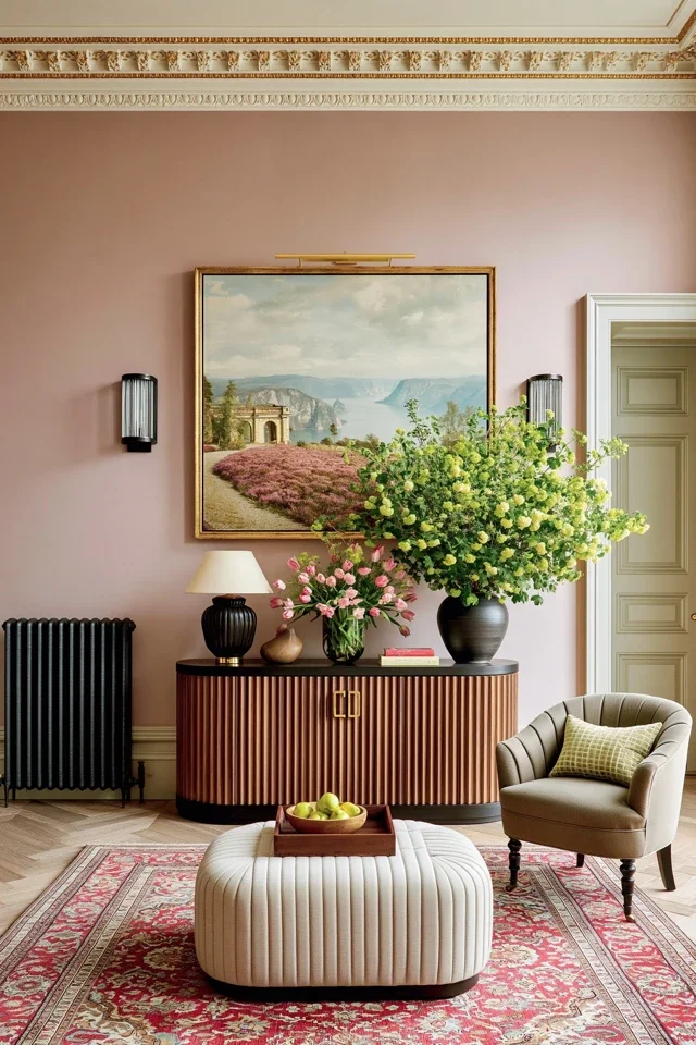
The way a home looks affects more than its appearance. Color, lighting and texture can shape how people feel within a space. Creating a home that feels inviting starts with understanding how these design elements work together.
COLOR SETS THE EMOTIONAL TONE
Color is one of the first things people notice when they walk into a room, no matter how well-designed or sparse a space is. The right shade can stir an emotional response that leaves a lasting impression.
Warm shades, such as soft terracotta, muted yellow and rosy pink, make a space feel more inviting, especially in living and dining rooms. Cooler colors, like cobalt blue and emerald green, elicit a calm response. Thus, they’re more popular in bedrooms and home offices.
Neutral colors, such as white, grey and beige, are a great choice for those looking for something more versatile. They give you more flexibility when picking out furniture, artwork and decorative accents for a room. Layering subtle variations of neutral tones can also create visual interest without making a space feel too busy.
Once you decide on a color, there are other factors that can affect how it’s perceived, for instance, lighting. A color may appear warm in the daytime but look drab once evening falls. Application also matters. Certain colors may need more coats or look different under different finishes. If you’re unsure what’s right for your home, reach out to professional painters for an expert opinion.
LIGHTING INFLUENCES ENERGY AND COMFORT
Lighting can affect a space’s effectiveness as well as its impact on an individual. Homes that receive plenty of natural daylight can feel more open and energizing, while darker rooms can seem smaller. To maximize daylight, position seating areas or workspaces around windows.
Artificial lighting should match the purpose of each room. For bedrooms, living rooms and dining spaces, choose warm white bulbs between 2,700K and 3,000K. Warm lighting can encourage relaxation and send signals to the brain to wind down. Cooler lighting between 3,500K and 4,000K is better suited for kitchens, laundry rooms, bathrooms and home offices, where concentration and alertness are needed.
Layering different types of lighting can help a room feel more balanced. Ambient lighting is ideal for overall illumination, task lighting is best for activities such as reading and accent lighting is great at highlighting artwork or architectural features. Use dimmer switches to adjust brightness level throughout the day and create a setting that matches the current mood.
TEXTURE CREATES EMOTIONAL WARMTH
Although it doesn’t receive as much attention as color and lighting, texture can have just as great an impact on a room’s mood. Spaces made up entirely of smooth surfaces, such as glass, metal and polished stone, can give off the feeling of being cold or even impersonal. If you’re trying to achieve the opposite effect, then reach for softer materials.
Layering different textures can also add more depth to a room without feeling cluttered. For example, a leather sofa paired with a knitted throw blanket and a wool area rug creates visual contrast while still being cohesive. A kitchen with laminate counters and metal appliances can be softened with a potted plant or terracotta tiles.
BALANCE IS MORE IMPORTANT THAN TRENDS
A comfortable home depends on how well color, lighting and texture work together. A room filled with dark colors may feel heavy if it lacks natural light, while a bright space with only hard surfaces can come off as sterile. Creating balance means giving each design element a purpose so that no single feature overwhelms the room.
Visual balance can also be achieved by mixing contrasts. Pair a soft fabric with wood or stone, use dark furniture to complement light-colored walls or layer overhead light fixtures with lamps and gallery lights. Repeating similar colors or materials throughout different rooms also helps create a connection between contrasting elements. It allows the home to feel more connected rather than disjointed.
Making thoughtful design choices can influence more than just a home’s appearance. The right use of color, light and texture can make a room feel more inviting, productive or relaxing. Focusing on how a room feels, rather than how it looks, can help create a home that feels good to live in.
Author Bio: Anthony M. Salvatori is President of Steadfast Painting Solutions. He has 20 years of painting experience and has been operating his own company for nine years. Salvatori is proud to be leading such an incredible team of individuals with the common goal of providing excellent service and quality. After attending Robert Morris University's undergrad program for Business Administration, he earned his Master of Business Administration. Salvatori began building his expertise in the painting industry at age 15 working under the mentorship of his parents in their family-owned painting business.
SOURCES
https://www.bhg.com/how-color-impacts-mood-11977778
https://www.housebeautiful.com/lifestyle/a71744426/home-lighting-color-temperature/