Introducing Farrow & Ball’s 2025 Paint Colors: A Vibe Curator’s Guide to Timeless, Soulful Interiors
Farrow & Ball, the iconic British paint brand renowned for its rich, nuanced hues and luxurious finishes, has unveiled 12 stunning new colors for 2025. Known for blending heritage craftsmanship with modern sensibility, this collection is designed for homes that feel both elevated and deeply personal.
If you love interiors that feel intentional, layered, and emotionally supportive, this palette is one to watch.
✨ The Vibe Curator’s Perspective
At Living Bright Interiors, I don’t approach color as decoration.
I approach it as environmental psychology.
Every shade influences how we rest, focus, connect, and feel in our homes.
As a Vibe Curator, I interpret collections like Farrow & Ball’s through three lenses:
emotional impact
sensory balance
real-life functionality
This is the same framework I teach inside The Vibe Curator’s Guide to Interior Design, where trends become usable systems for everyday living.
👉 Explore the Guide Here →
https://www.livingbrightinteriors.com/bookpackages/p/the-vibe-curators-guide-to-interior-design
🎬 Want to See This in Real Life?
I’m currently transforming a South Charlotte townhouse room by room—color, layout, texture, and flow.
▶ Watch the full transformation here → Townhouse Series Playlist
Meet the 12 New Colors for 2025
Each new shade has been meticulously crafted to enhance a variety of spaces, from bold statement walls to subtle, elegant backdrops. Farrow & Ball continues to set the tone for sophisticated, heritage-inspired interiors, and this year’s palette doesn’t disappoint.


The 12 New Colors for 2025:
Dibber – Earthy, mossy green inspired by traditional gardening tools.
Douter – Sooty gray-green with a sophisticated, smoky depth.
Duster – Deep ochre reminiscent of a well-loved duster cloth.
Kakelugn – A tranquil, light blue inspired by Swedish tile stoves.
Marmelo – Warm burnt orange, evoking the coziness of quince jam.
Naperon – Faded terracotta for a rustic, organic look.
Reduced Green – Dark, muddy green with rich brown undertones.
Scallop – Soft off-white with delicate pink undertones.
Sizing – Crisp, blue-based off-white for a fresh, clean feel.
Broccoli Brown – Reintroduced deep stone shade for natural interiors.
Etruscan Red – Classic, rich brown-red perfect for timeless elegance.
Sap Green – Deep, saturated olive green making a bold statement.
⭐ The Vibe Curator Formula for Using These Colors
When I design with heritage brands like Farrow & Ball, I follow a simple system:
1. Base Mood
Choose one primary shade that sets the emotional tone of the room.
2. Sensory Balance
Layer textures—linen, wood, plaster, stone—to prevent flatness.
3. Lifestyle Support
Match color placement to how you actually use the space.
This prevents “pretty but impractical” design.
This system is expanded inside The Vibe Curator’s Guide, with room-by-room examples and sourcing shortcuts.
Why Farrow & Ball Paint is Worth the Investment
If you’re new to the world of Farrow & Ball, you might be wondering—why all the hype? Here’s why their paint remains a favorite among designers and homeowners alike:
Unmatched Depth & Pigment – The brand’s distinctive use of high-quality ingredients results in a unique depth that shifts beautifully with natural and artificial light.
Eco-Friendly Formulas – Farrow & Ball has been ahead of the curve in providing low-VOC, water-based paints that are as kind to the environment as they are to your walls.
Exceptional Durability – Their finishes are designed to withstand daily wear while maintaining their exquisite appearance.
Effortless Elegance – Whether you choose their classic matte Estate Emulsion or the washable Modern Emulsion, each finish offers a timeless, lived-in look.
Where to Use These New Colors
Wondering where to incorporate these fresh hues? Here are a few ideas:
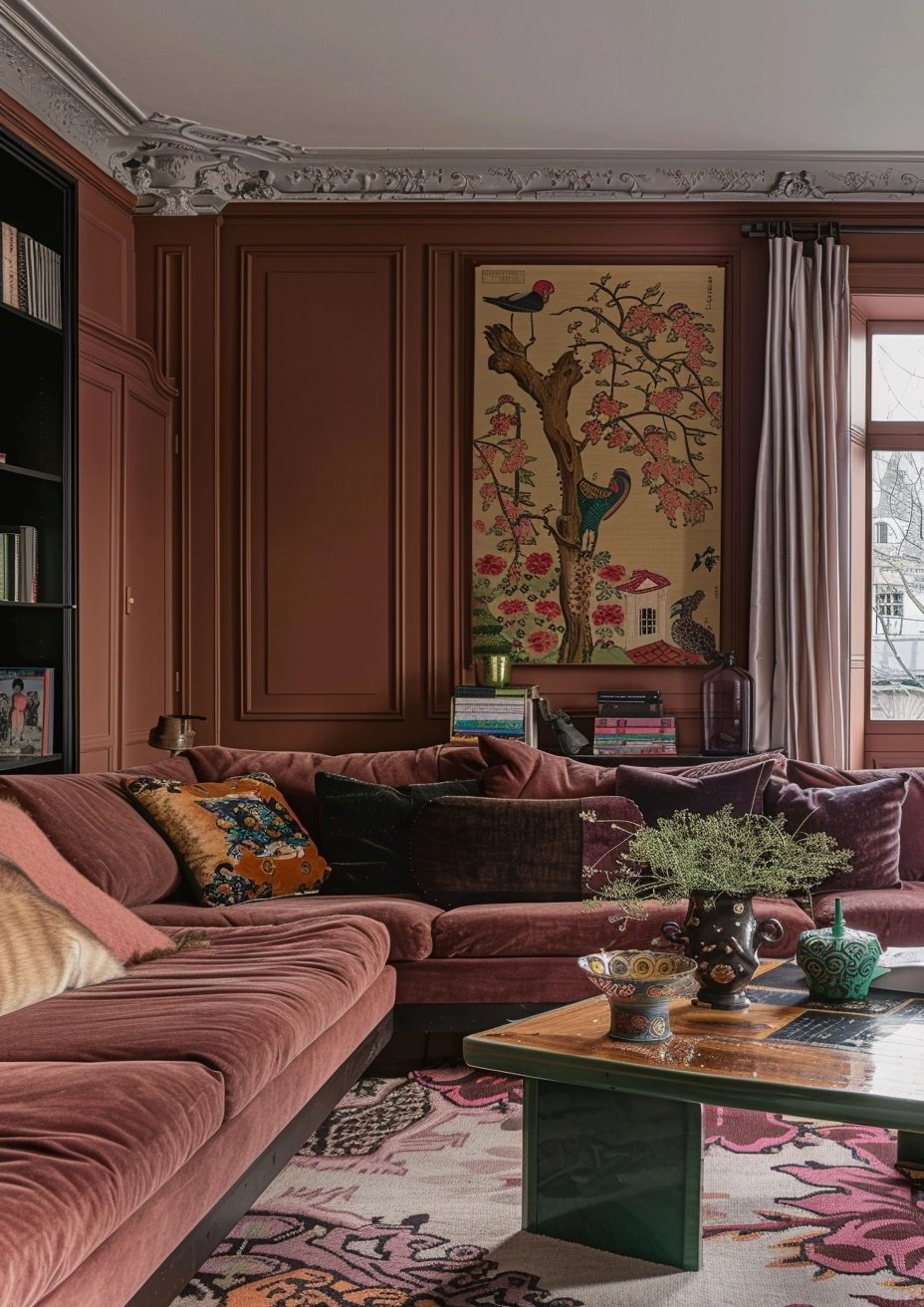
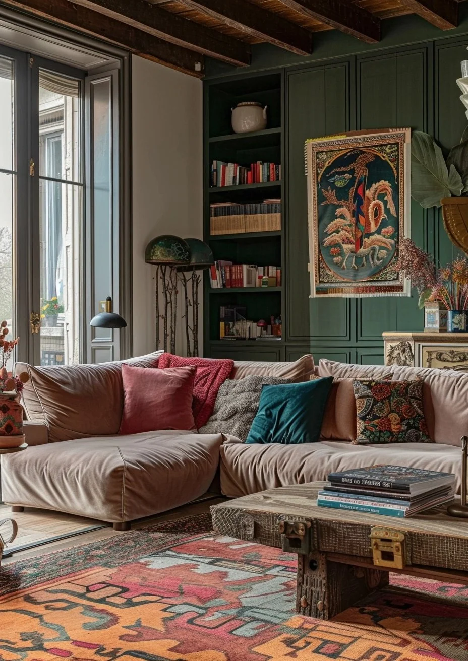
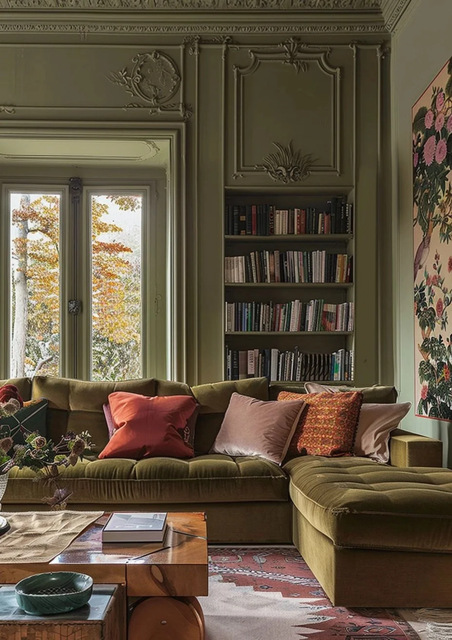
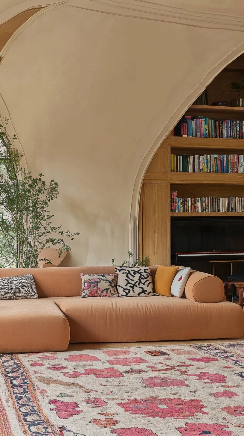
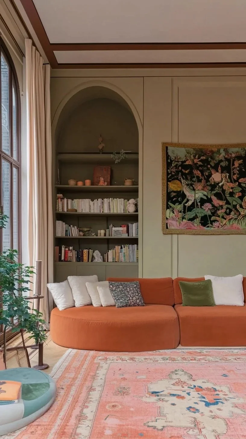
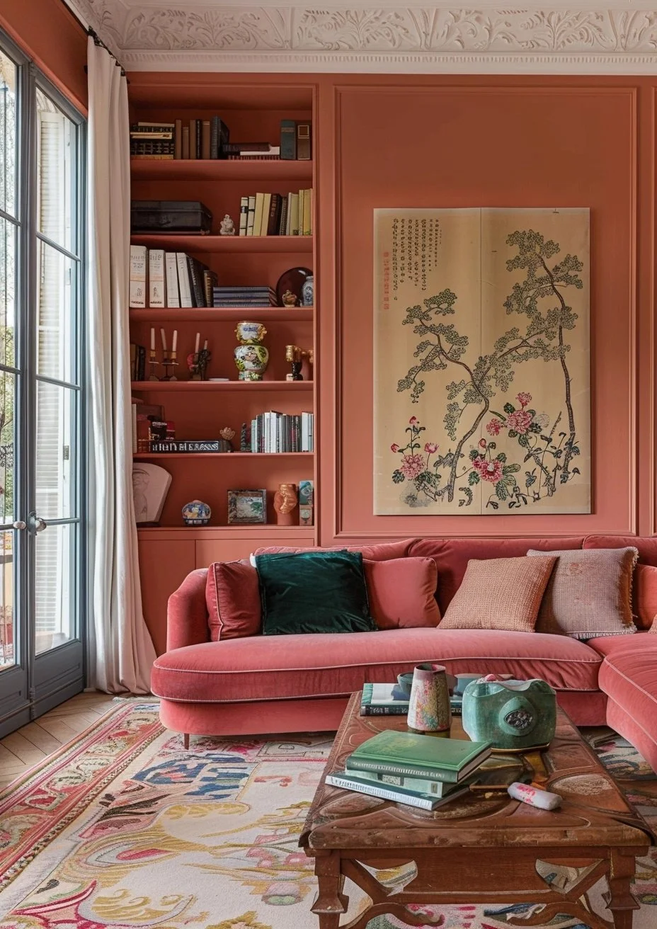
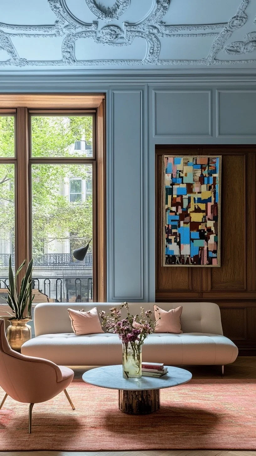
Living Rooms – Create a cozy yet sophisticated ambiance with a rich neutral or a deep, inviting blue.
Kitchens – Introduce a pop of color on cabinets or a feature wall to modernize your space.
Bedrooms – Soft pastels or earthy tones can set the mood for a restful retreat.
Home Offices – A grounding shade can enhance focus and creativity while adding a designer touch.
🎯 Want This Done For You?
Choosing colors is only step one.
Applying them correctly is where most people get stuck.
Inside The Vibe Curator’s Guide, you’ll find:
✔ Room formulas
✔ Palette builders
✔ Layout psychology
✔ Amazon sourcing shortcuts
So you’re never guessing.
Final Thoughts: Designing With Intention
Farrow & Ball’s 2025 palette reflects a broader shift toward homes that feel:
grounded
emotionally safe
visually calm
quietly luxurious
Great design isn’t about chasing trends.
It’s about creating environments that support your life.
That’s the heart of Vibe Curation.