2026 Color of the Year: What’s Been Announced (and What’s Still Predicted)
Every fall, design lovers, stylists, and color forecasters turn their attention to one question: what shades will define the coming year? Several big paint brands have already revealed their 2026 Colors of the Year—while Pantone’s announcement is still a few months away. Here’s your full guide to what’s official, what’s speculated, and how to bring these shades into your home right now.
Vibe Curator Note:
At Living Bright Interiors, I don’t look at “Color of the Year” trends as just paint picks. I look at them as emotional signals. Every trending color reflects what people are craving emotionally—calm, grounding, optimism, safety, creativity.
In The Vibe Curator’s Guide to Interior Design, I teach how to read these signals and use them intentionally—so your home supports your nervous system, energy, and lifestyle instead of just following trends.
✅ Confirmed 2026 Color of the Year Picks


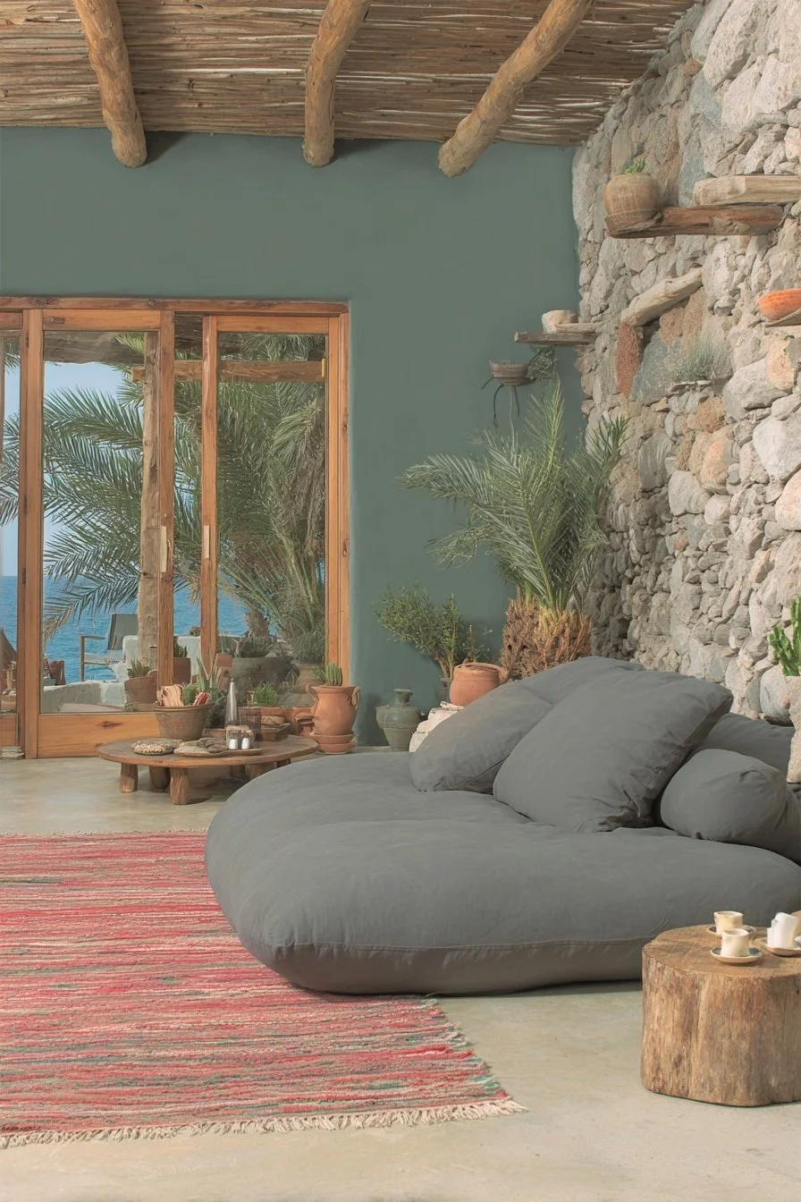
Behr – Hidden Gem
A smoky jade blue-green that feels both serene and bold. Perfect for statement walls or cabinetry.
Vibe Read:
Hidden Gem taps into what I call Restorative Focus Energy—it’s calming without being sleepy. This is a color that supports deep thinking, creativity, and emotional reset.
If you’re feeling overstimulated at home, shades like this help regulate stress and bring your system back into balance.
➡️ Try it with Amazon décor finds in jewel tones and pair with Farrow & Ball’s Treron or Green Smoke for layering.
Houzz Inspiration Board →


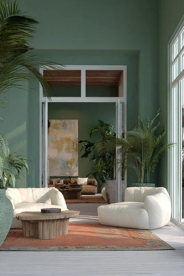
Valspar – Warm Eucalyptus
A muted, sage-green that channels calm, organic minimalism.
Vibe Read:
Warm Eucalyptus reflects our collective desire for grounding and safety. Green tones consistently show up during periods of uncertainty because they mimic nature and stability.
In Vibe Curation, this is a “Nervous System Neutralizer” color—ideal for bedrooms, offices, and family spaces.
➡️ Works beautifully on millwork or as a soft backdrop for earth-toned furniture. Add Amazon eucalyptus décor accents.


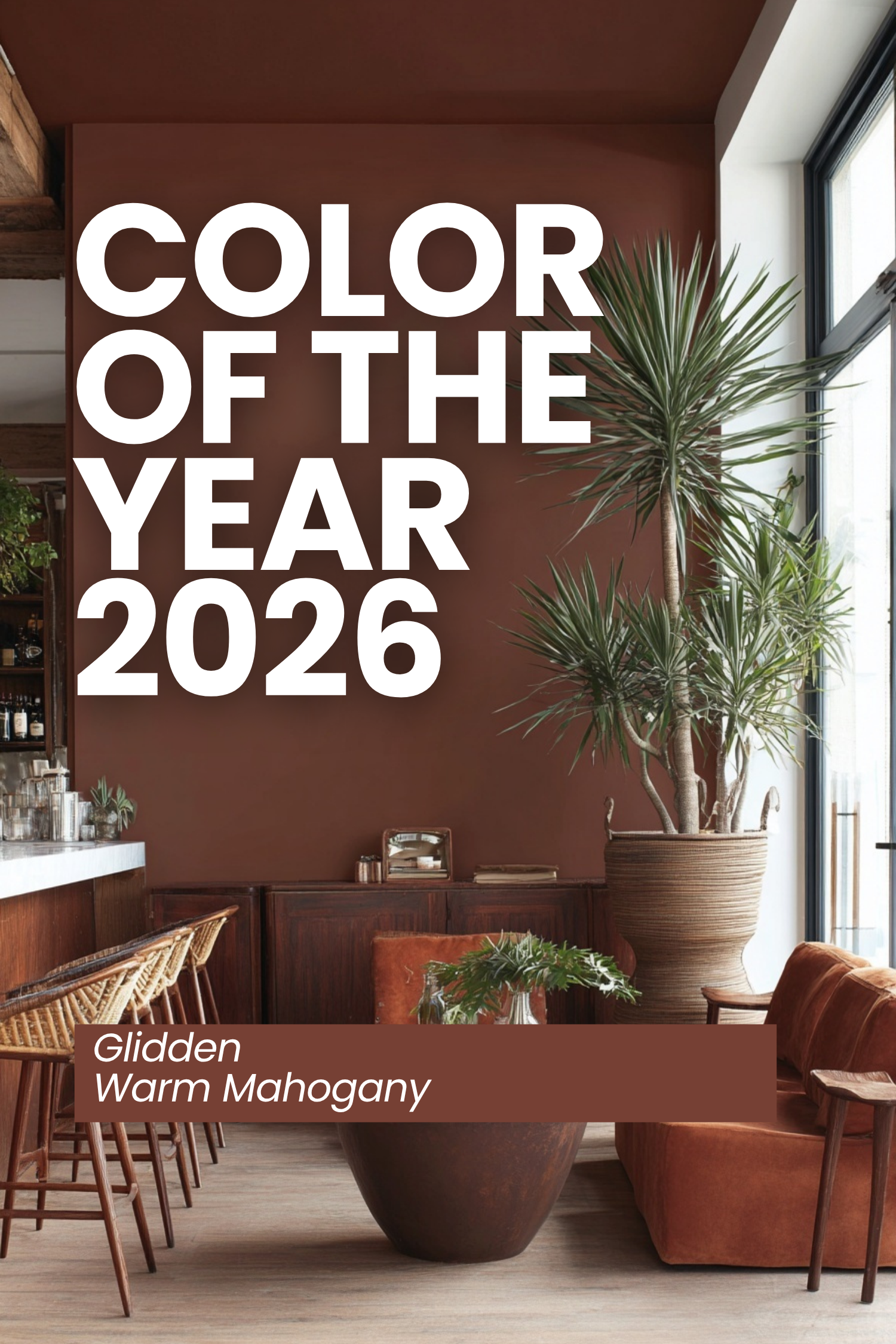
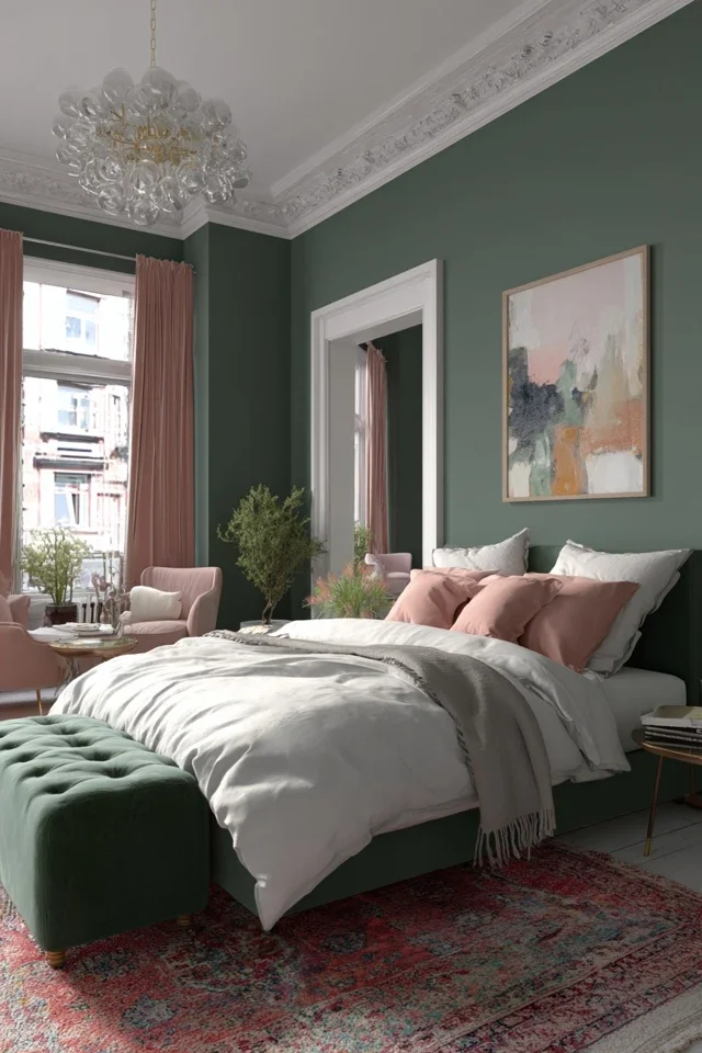
Glidden – Warm Mahogany
Vibe Read:
Deep reddish-browns like this activate warmth, intimacy, and emotional comfort. They’re especially powerful in spaces where connection matters—dining rooms, conversation areas, and reading corners.
This color supports what I call Containment Energy—helping a space feel secure and emotionally held.
A rich berry-brown/red that balances heritage and modern warmth.
➡️ Perfect for dining rooms, trim details, or cozy holiday styling. Try with Farrow & Ball’s Preference Red.


Minwax – Special Walnut (Stain)
Not technically a paint color, but this classic warm wood stain was named their “Color” of the Year.
Vibe Read:
Wood tones are consistently linked to feelings of safety and trust. Even veneer or stained finishes can trigger positive physiological responses.
This is why I often recommend wood-forward elements when clients feel disconnected or unsettled in their homes.
➡️ Ideal for DIY furniture refinishing projects—source unfinished pieces on Amazon.


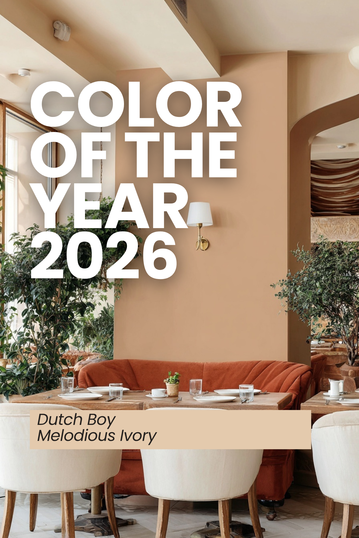
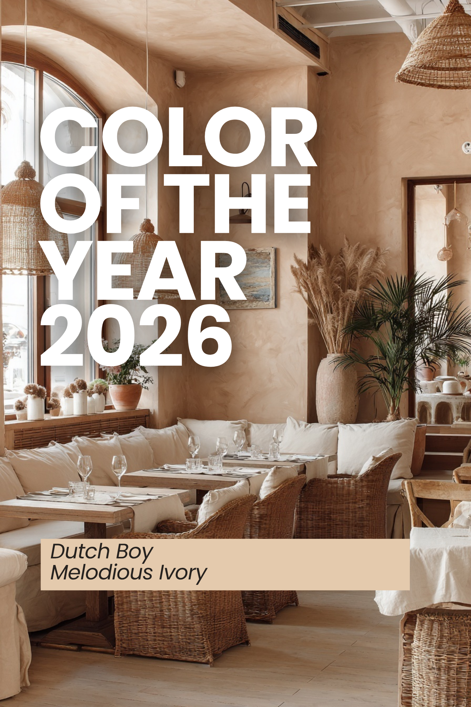
Dutch Boy – Melodious Ivory
A creamy, nostalgic beige that makes an excellent neutral backdrop.
Vibe Read:
Soft ivories and warm neutrals create what I call Emotional Breathing Room. They give your mind space to rest and prevent visual overload.
This makes them ideal foundations for layered, personalized spaces.
➡️ Consider it as an all-over wall color, paired with natural textures.
Want to Design With Intention, Not Guesswork?
The Vibe Curator’s Guide to Interior Design teaches you how to:
Decode trends emotionally
Build cohesive color stories
Create spaces that support your mood and focus
Avoid costly impulse buys
→ Explore the Guide Here:
https://www.livingbrightinteriors.com/bookpackages/p/the-vibe-curators-guide-to-interior-design


How Vibe Curators Use Trend Forecasts
Instead of chasing every new color, I recommend filtering trends through three questions:
How do I want to feel in this space?
What emotions do I want this room to support?
What energy am I inviting into my daily life?
This is the core method I teach inside The Vibe Curator’s Guide—using trends as tools, not rules.
🔮 Predictions for Pantone’s 2026 Color of the Year
Pantone typically announces in early December (last year’s was Dec 5). While they haven’t revealed their choice yet, design media and forecasters are already buzzing.
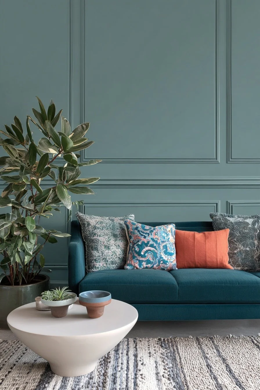
WGSN/ColorO
Declared their pick: Transformative Teal – a blue-green shade symbolizing redirection, resilience, and growth
Better Homes & Gardens Predictions
Suggests hues from light dusty teal and powder blues to butter yellow and earthy olives.
Livingetc Editors’ Predictions
Teal (deep, rich, and cocooning)
Milk Chocolate (velvety brown)
Golden Yellow
Army/Matcha Green
Celery (soft chartreuse)
Forbes & Trend Analysts
Consensus: expect green or teal—reflecting ecological awareness and calm energy.
✨ Why This Matters
Colors of the Year don’t just dictate paint trends—they ripple into furniture, fashion, and even holiday décor. By knowing what’s already official (Behr, Valspar, Glidden, Minwax, Dutch Boy) and watching what’s predicted (Pantone, WGSN, editors), you can stay ahead and curate a space that feels both timely and timeless.
When you understand the emotional language behind color, trends stop feeling overwhelming—and start feeling empowering.
If you want to learn how to translate trends into deeply personal, supportive spaces, The Vibe Curator’s Guide to Interior Design walks you through the entire process step by step.